Fan energy is a whole different beast, and we love designing for it. This section highlights event branding, live-moment creatives, car wraps, and even our Liquipedia F1 expansion: all built to pull people in, boost engagement, and make big moments feel even bigger.
Fan Engagement & Event Marketing
Project Selection


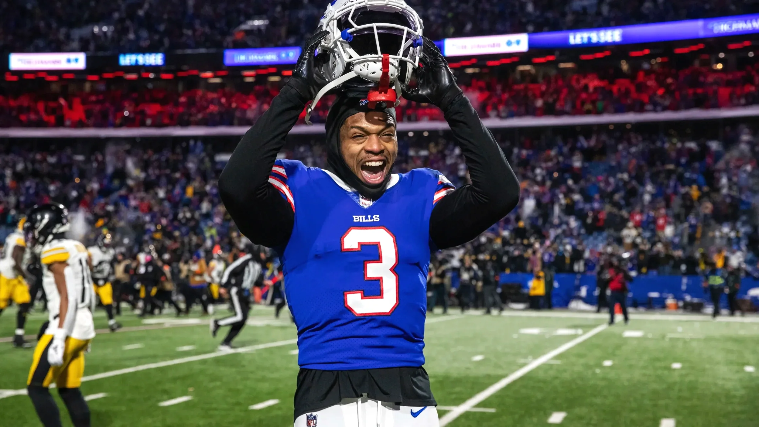
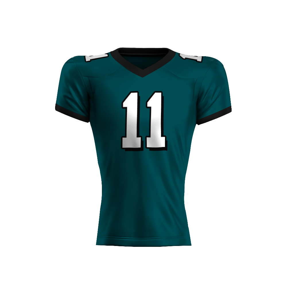
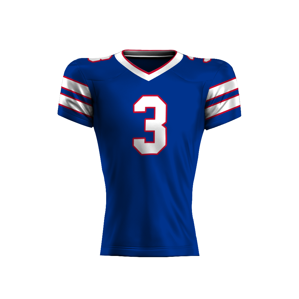
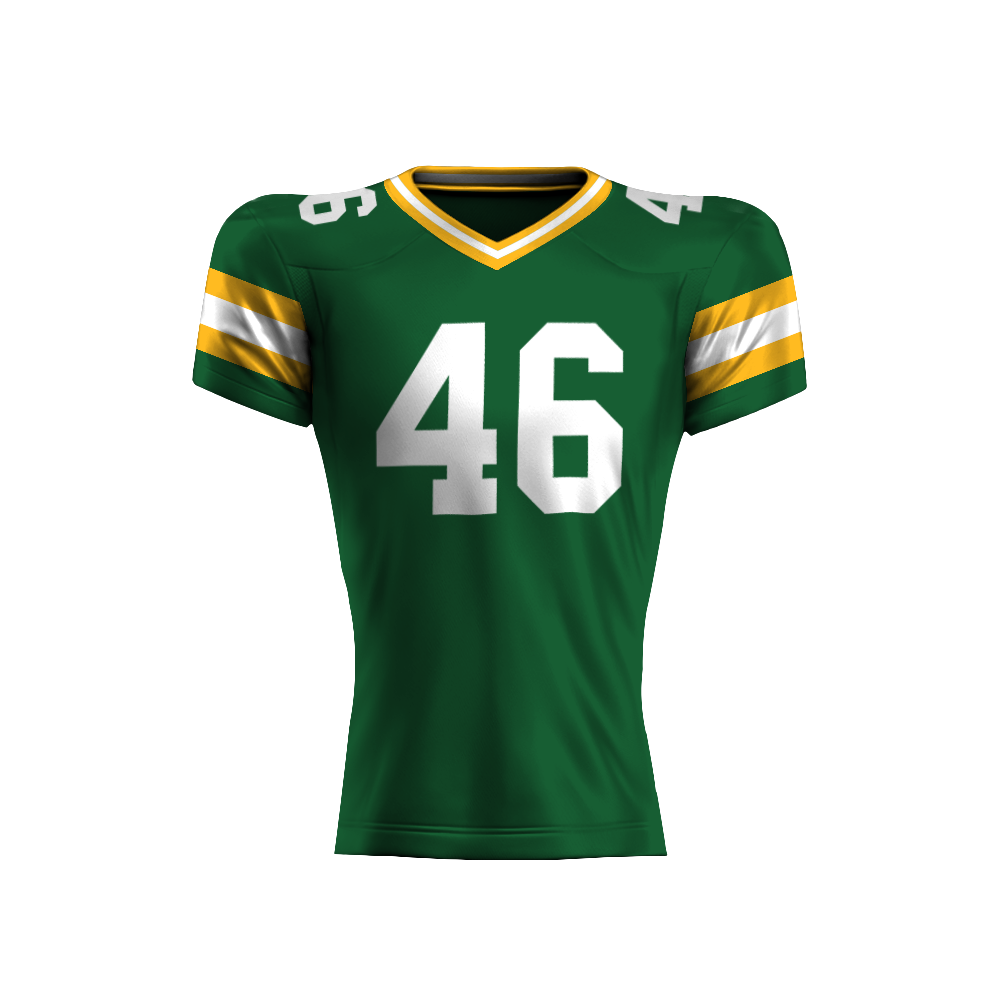
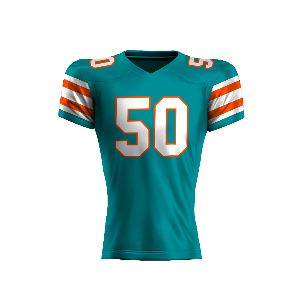
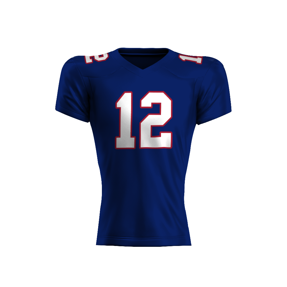
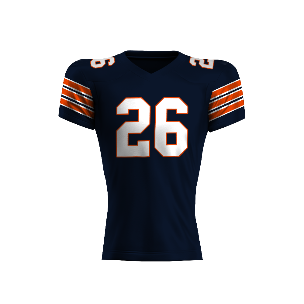
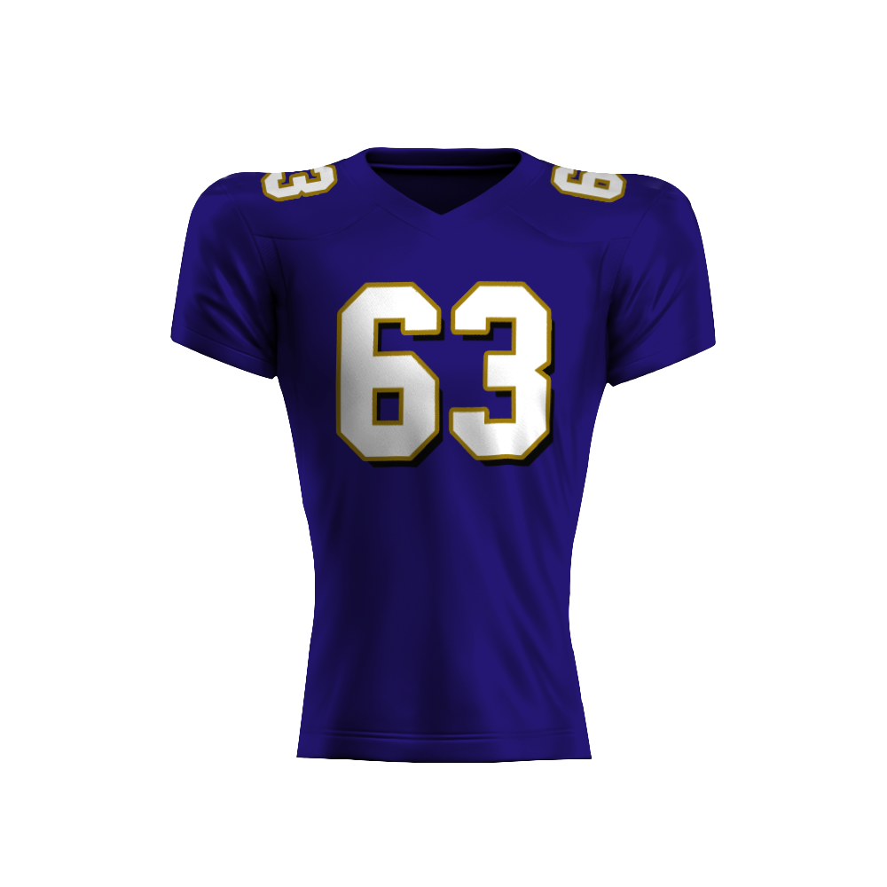
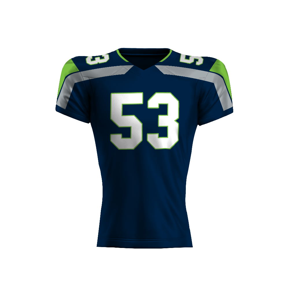
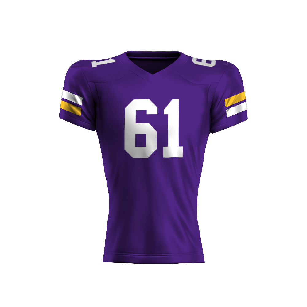
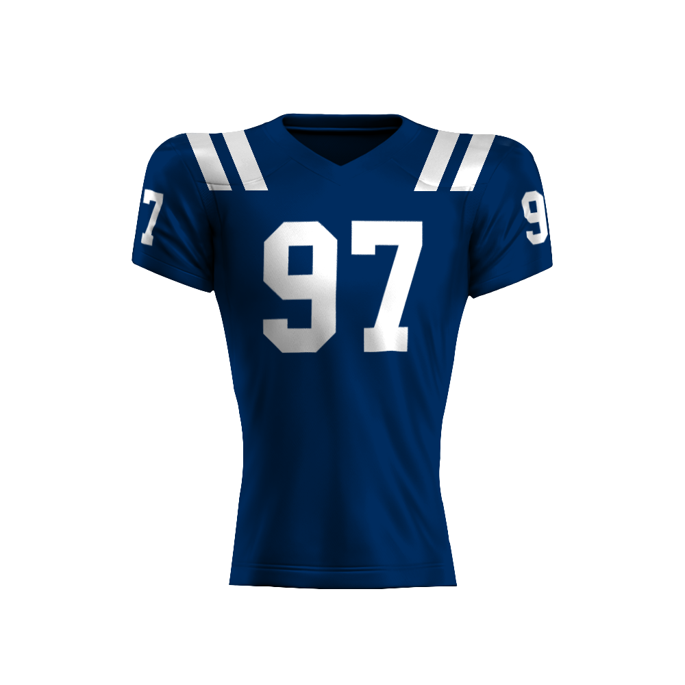
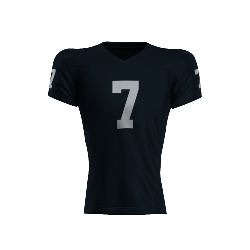
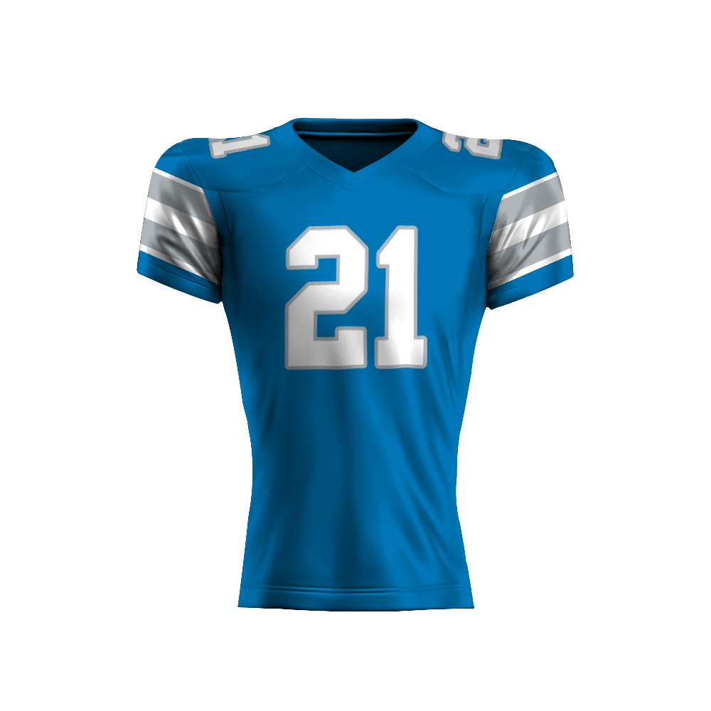
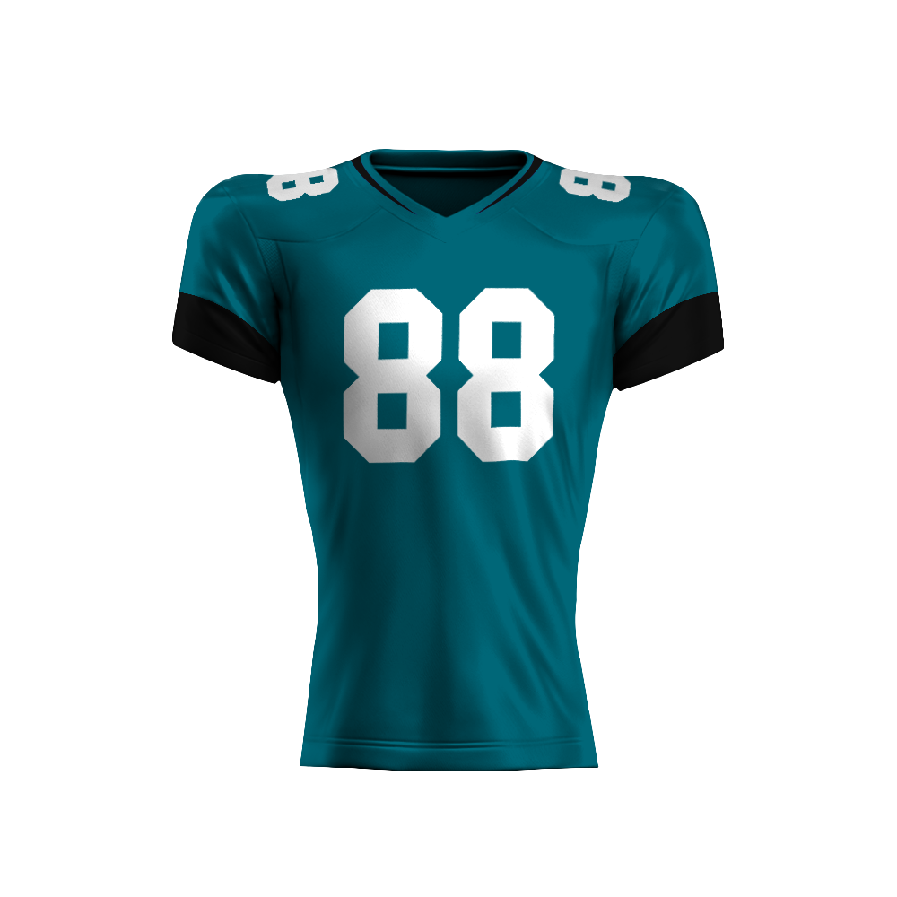
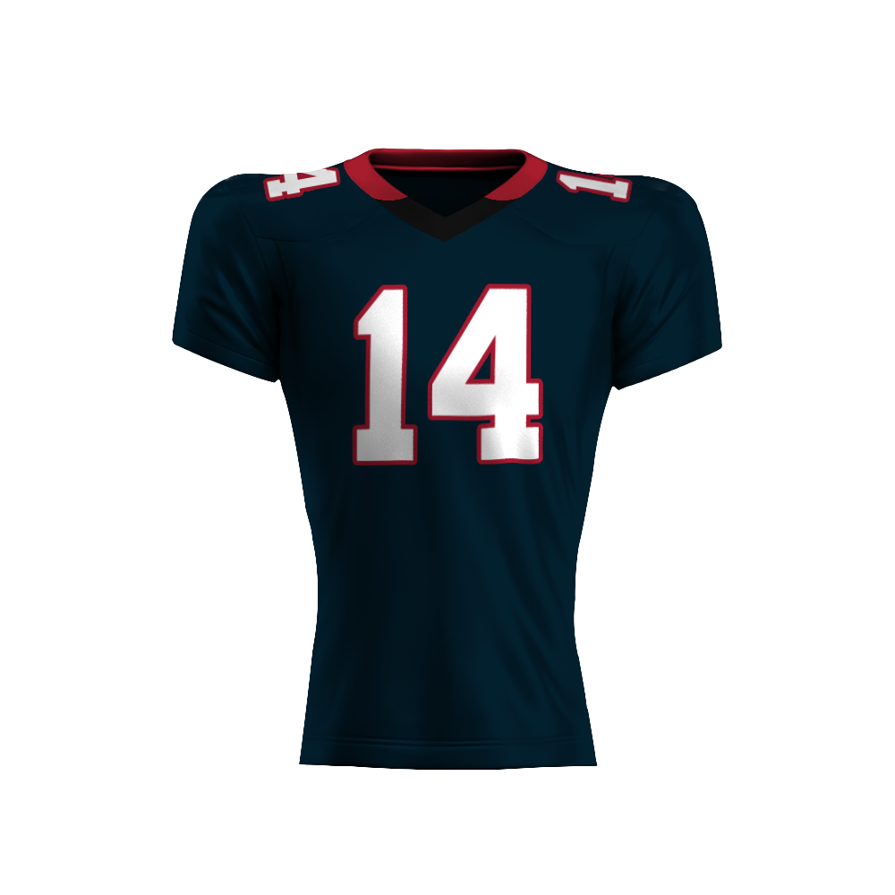
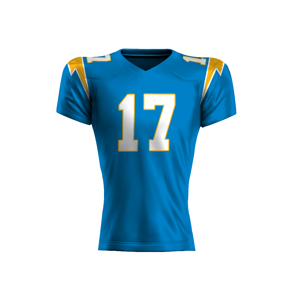
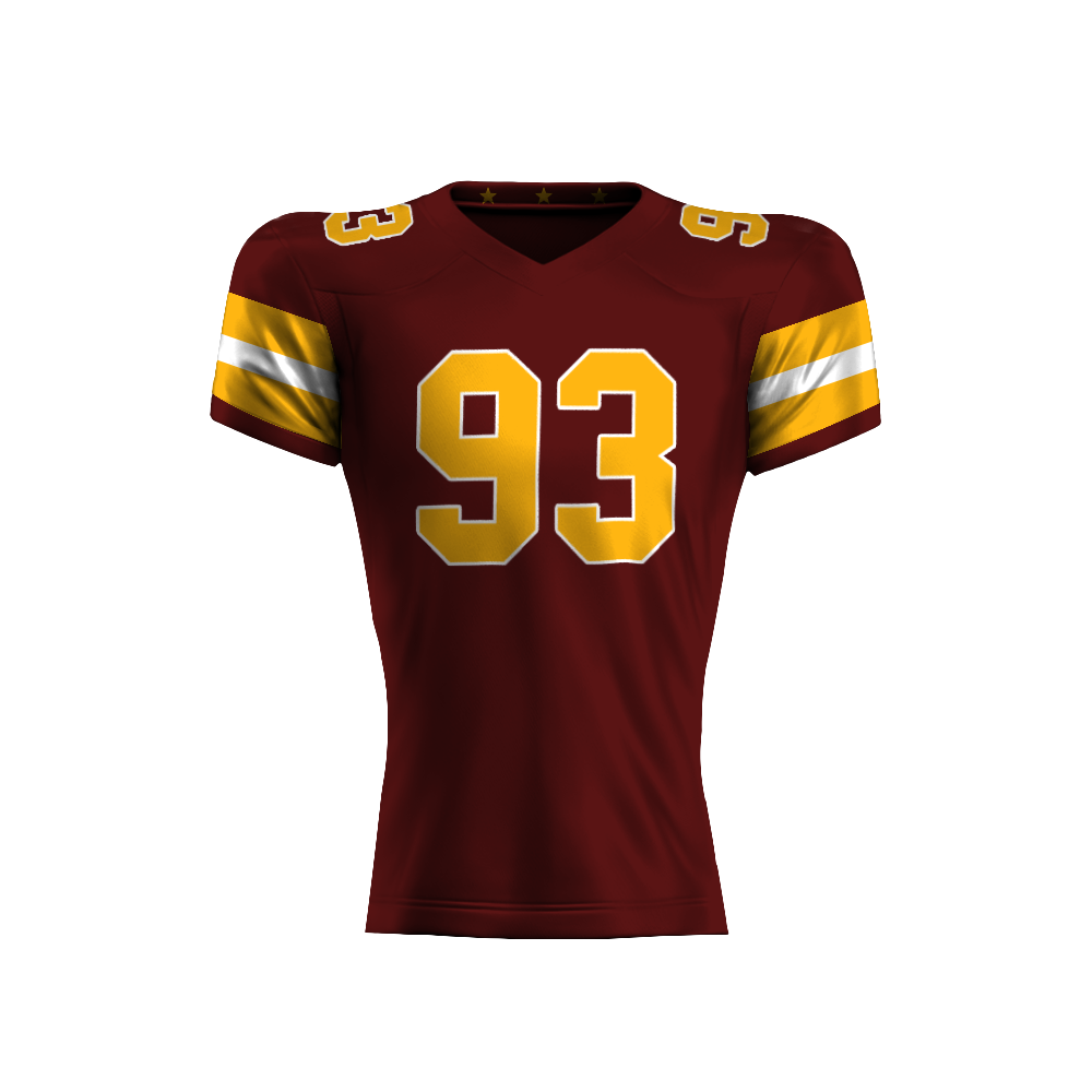
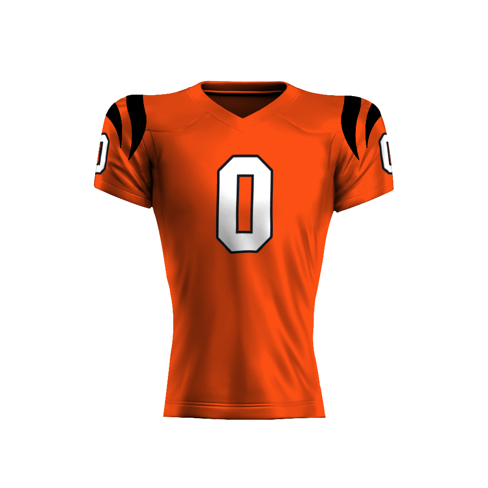
theScore & ESPN Bet NFL Jersey System
32 Teams, 3000+ Assets, One Unified Solution
A rapid-turnaround project built to solve a massive limitation: no NFL player photography allowed. We created a league-wide jersey system that aimed to showcase the authenticity of every NFL team, all without logos, and produced thousands of assets for use across the United States and Canada through the app and marketing.
The Problem
When I joined theScore, the app was stuck using generic player initials every time a player appeared in a bet slip or live market. No photos, no likeness, and no branding. I related it to an empty iPhone contact card showing up in one of the biggest sports-betting apps in North America and Canada.
Leadership had spent months trying to crack a solution that looked authentic, scalable, and legal. The ask landed on my desk with one question: “Do you think this is even possible?”
I teamed up with Cam Hodge, our motion designer, and we started building.
The Plan
Build fast, build authentically.
Within 24 hours, Cam and I entered a kickoff call with a working jersey template, a scalable export system, and a production plan that impressed upper leadership and execs. We laid out our plans on how to design, customize, and implement 3000+ fully authentic (logo-free) NFL jerseys, all before the start of the season.
This immediately shifted the project from “Is this even freakin’ possible?” to “How quickly can we get this implemented?”

Designing 32 Authentic Jerseys
The core challenge was accuracy. We couldn’t use NFL logos, team badges, or official marks, but the jerseys still needed to feel exactly like the real thing.
We studied stitching patterns, collar constructions, striping systems, number typography, color calibration, and every uniform variation across all 32 teams. The goal was to get close enough that any fan could instantly recognize their team, all without crossing licensing lines.
Every jersey we produced was fully custom, team-accurate, and designed to support dynamic numbering for any player.
Scaling It
3,000+ NFL jerseys, all delivered early.
Once the designs were locked, we built a system that was capable of exporting thousands of jersey variations quickly and consistently.
Over a few weeks, we produced 3,000+ exports covering every team, every number, and every state needed for app integration.
The dev team plugged them into theScore and ESPN BET ahead of NFL kickoff; something that felt impossible when the project started.
The Results
The jerseys launched league-wide for NFL Week 1, replacing the empty “initials” avatars with a system that felt alive, branded, and built for football fans.
After launch, the system expanded outside the app and into marketing collateral, promos, and social content; becoming a foundational visual element for the NFL season.
The project was called one of the most efficient and well-executed rollouts of the year by multiple managers and execs.


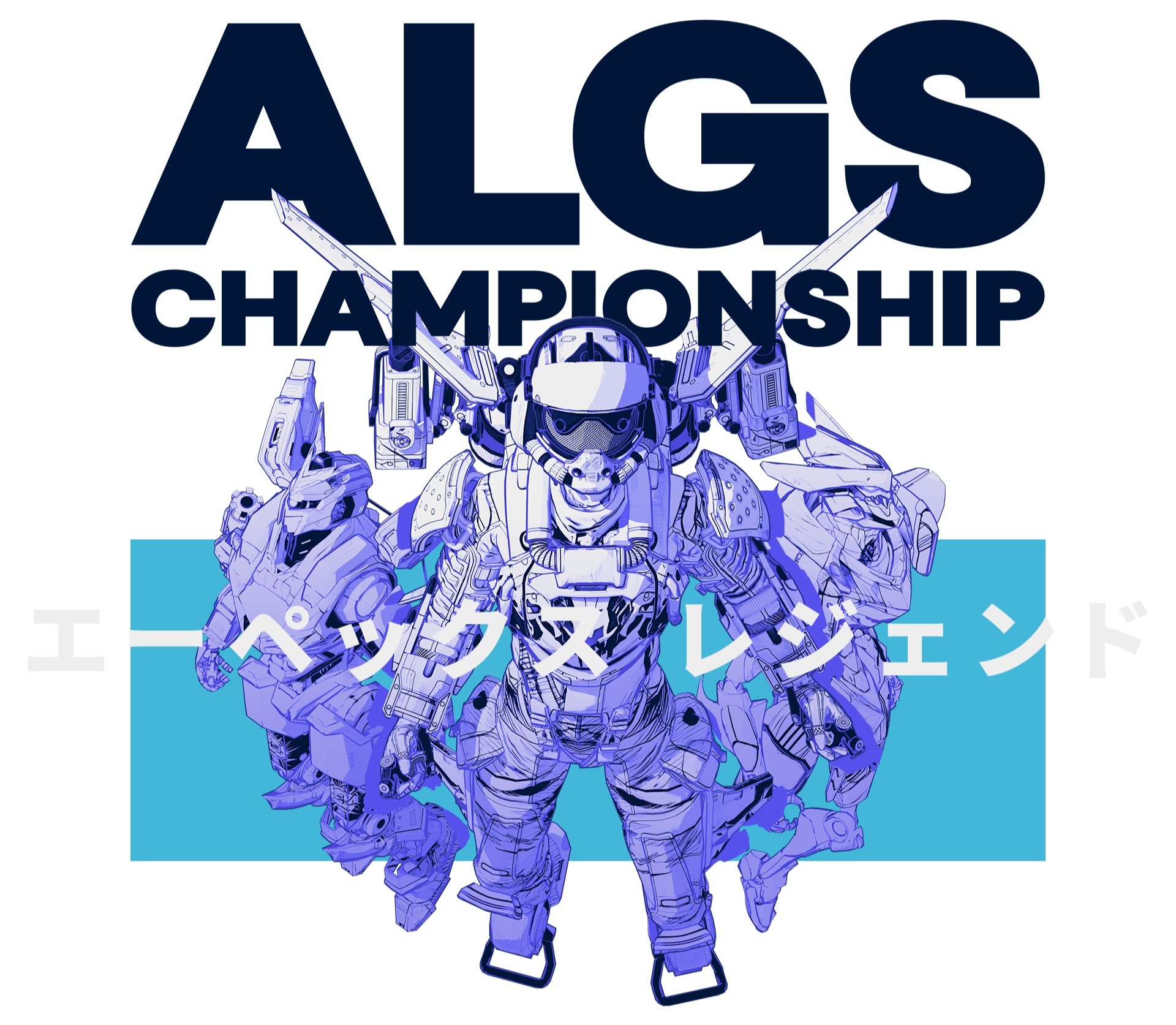
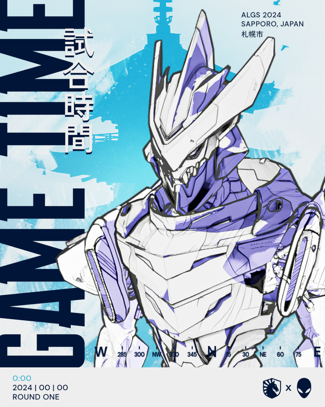
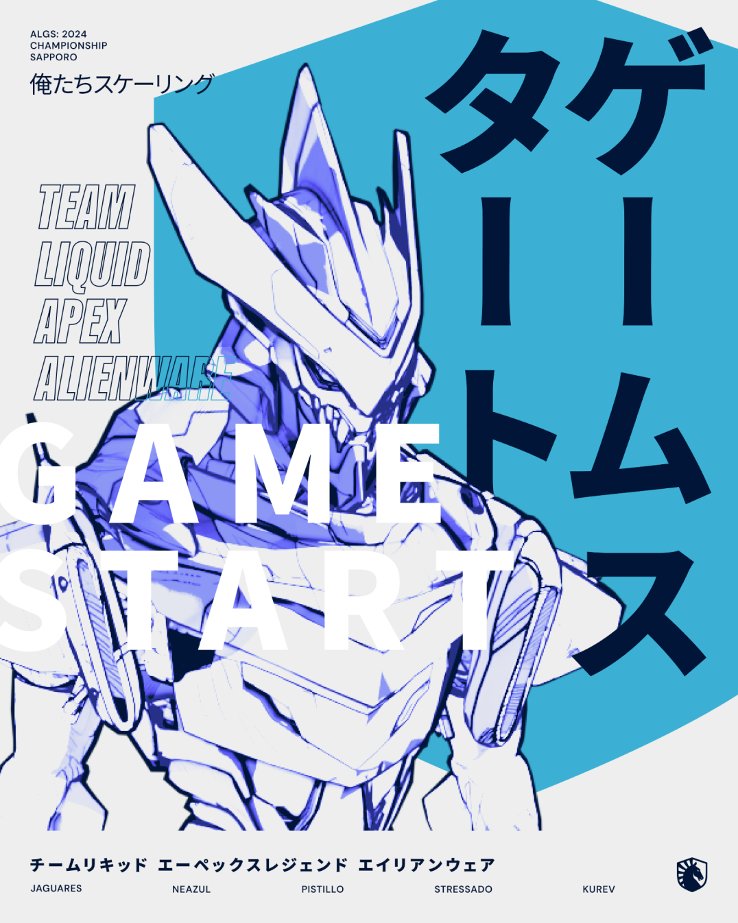
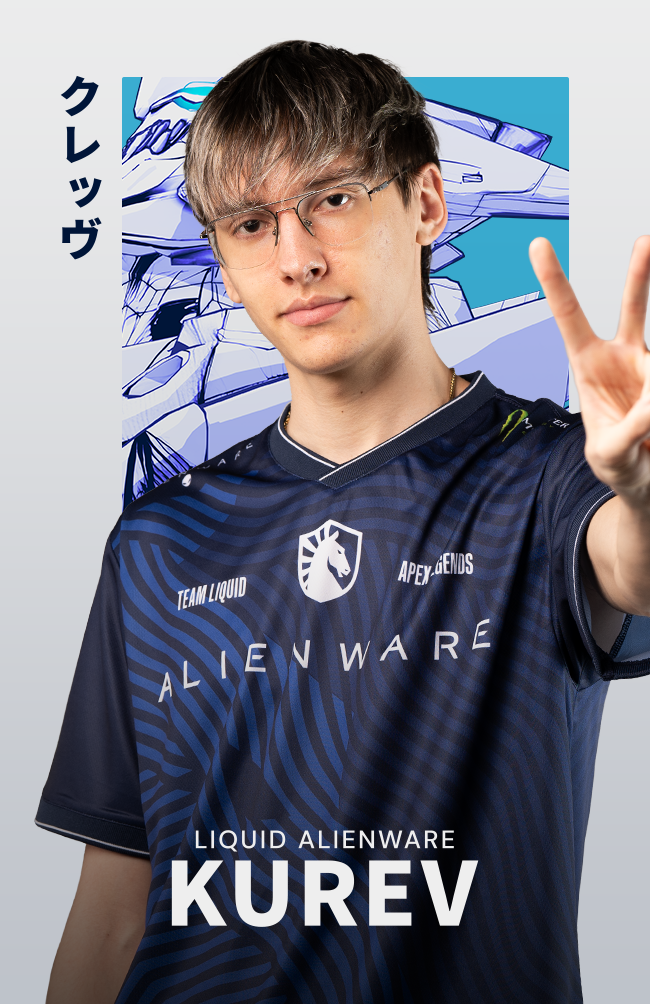
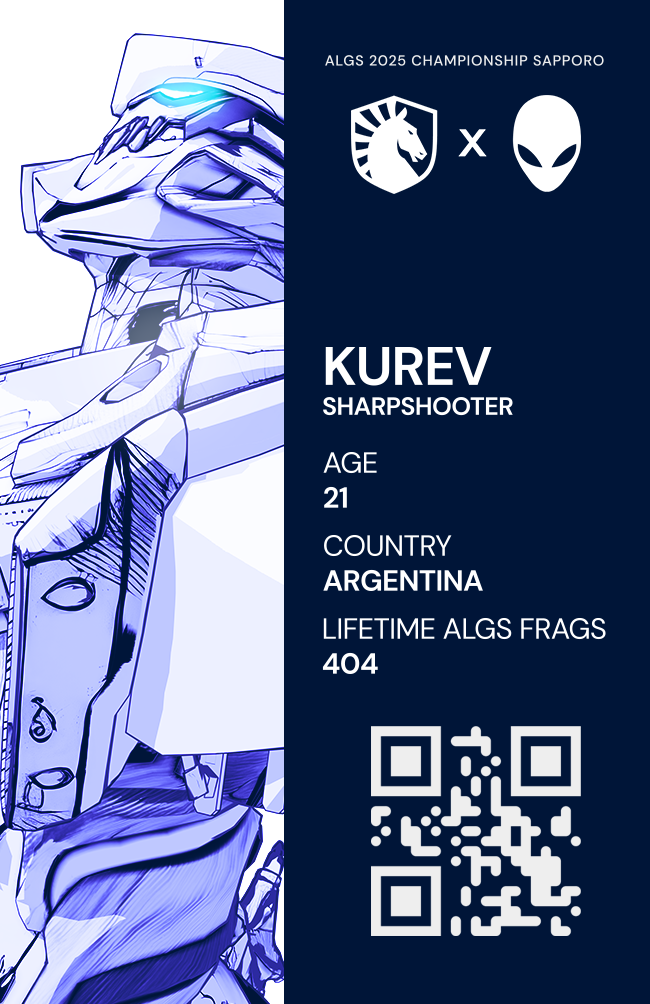
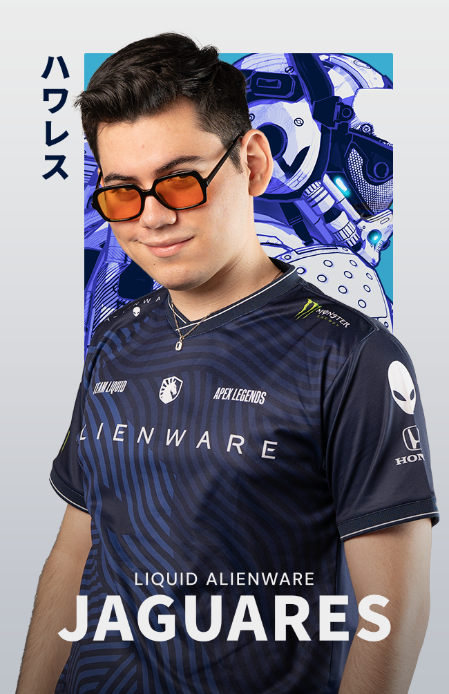
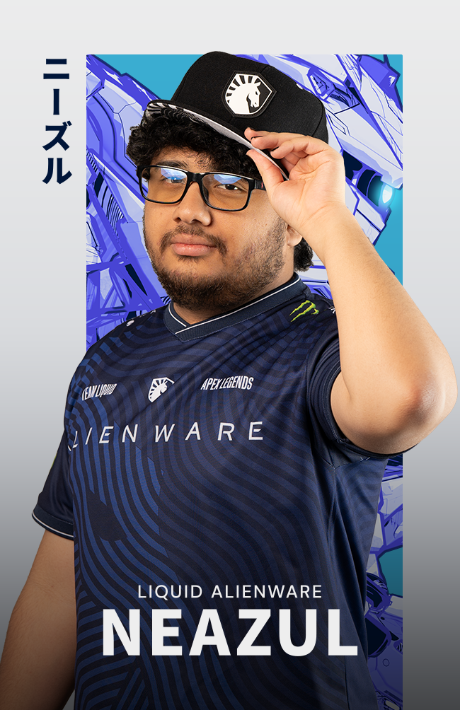
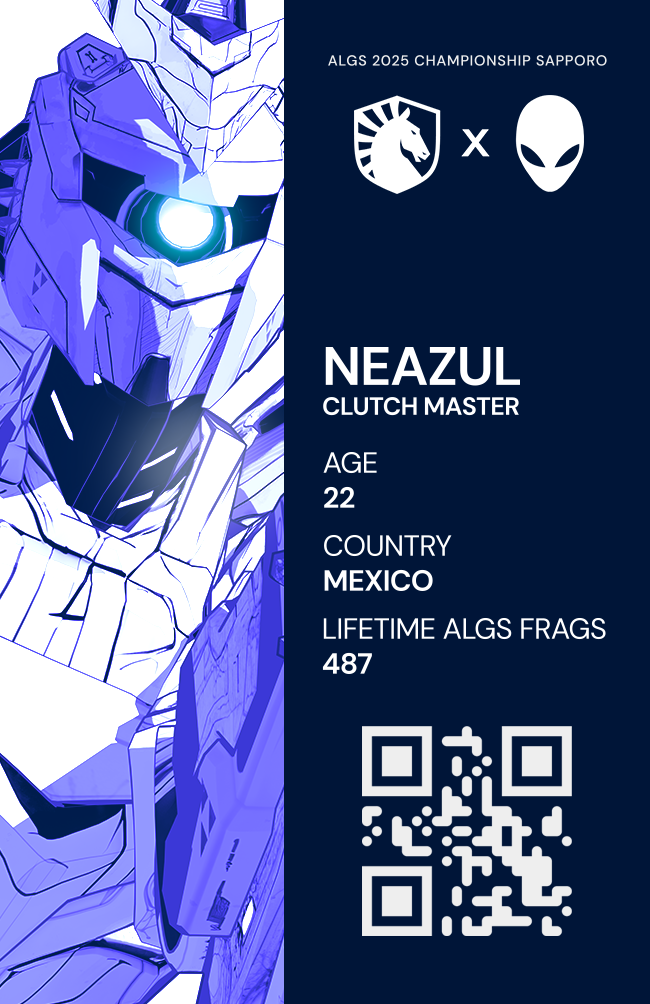
ALGS Sapporo Championship
The ALGS Championship is the premier tournament for popular game Apex Legends. This year, the tournament was taking place in Sapporo, Japan. When we were approached about tackling the graphics for this, we jumped all over it. Working alongside Tiago Paixao and Stacey Yamada from Team Liquid, we came up with one hell of a campaign.
Deliverables
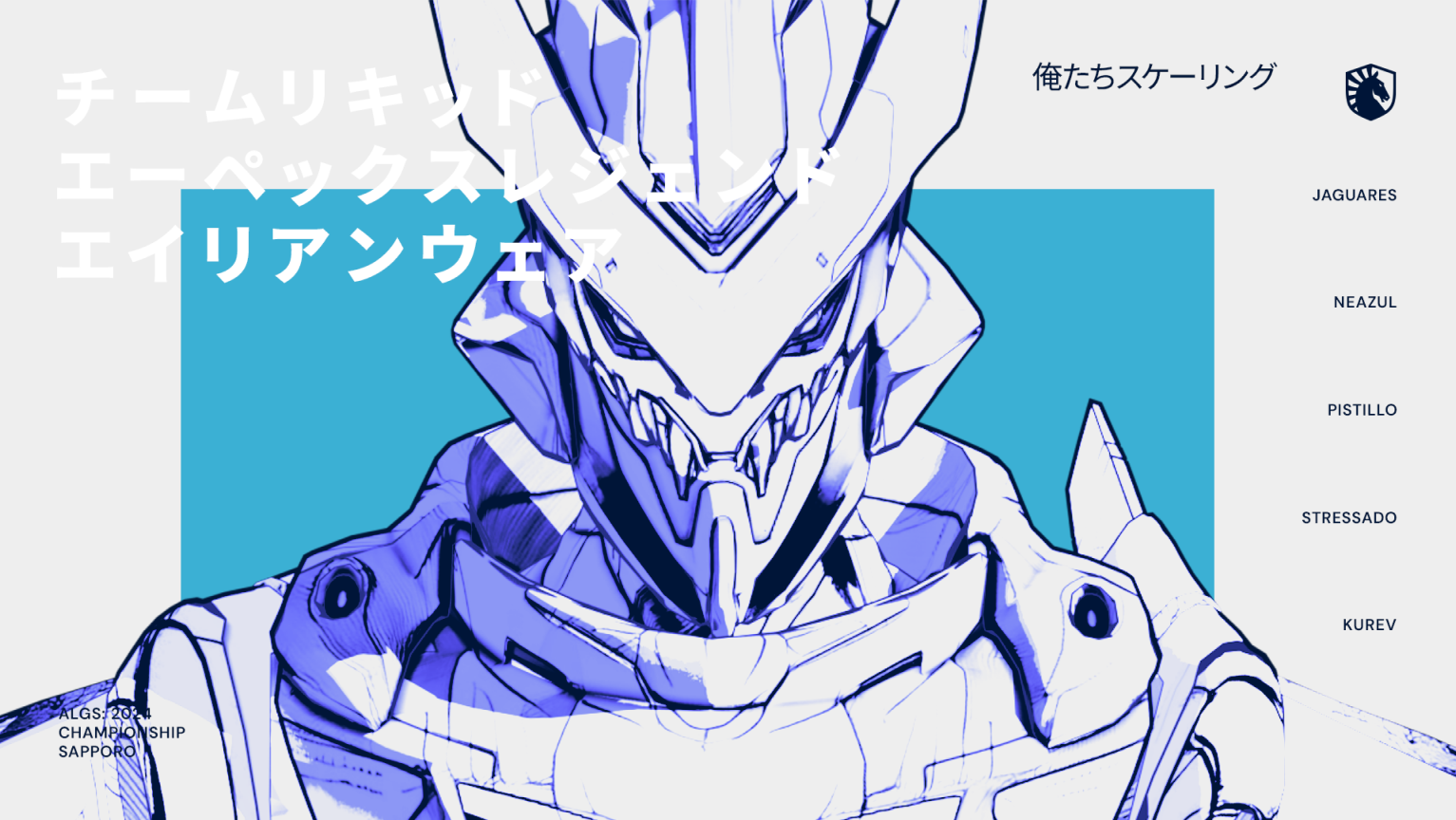
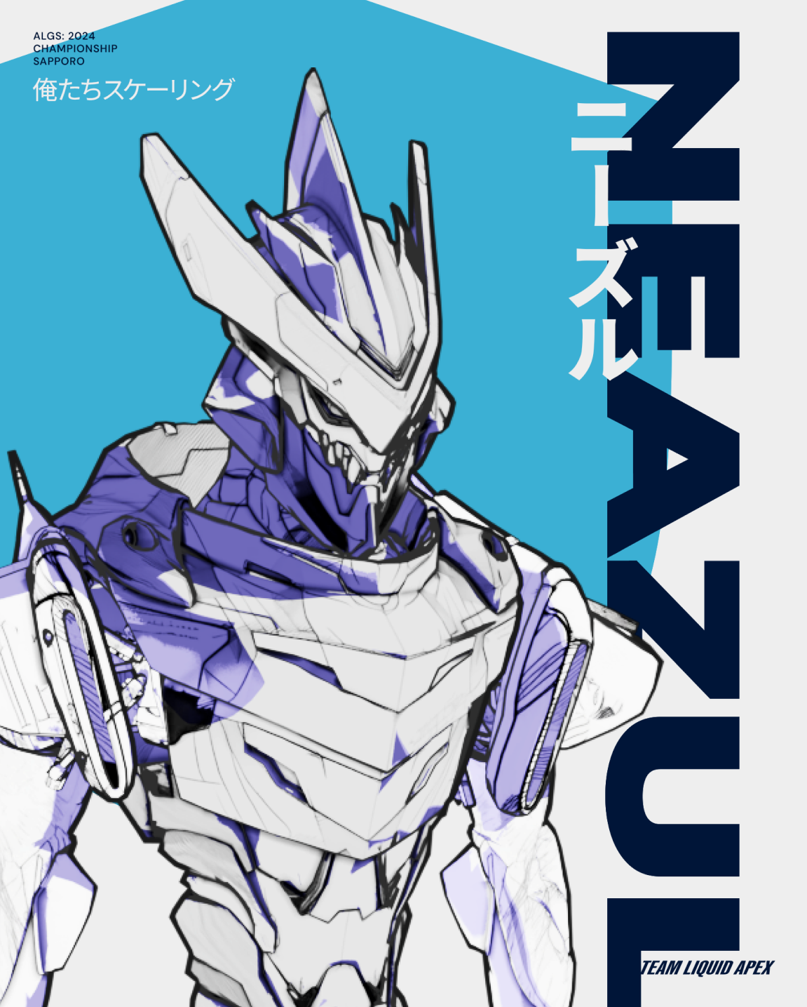
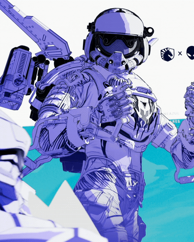
Legend Renders
Creation of close to 20 legend renders from Apex Legends
Artistic touches to the renders to add depth and a further anime feel
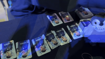
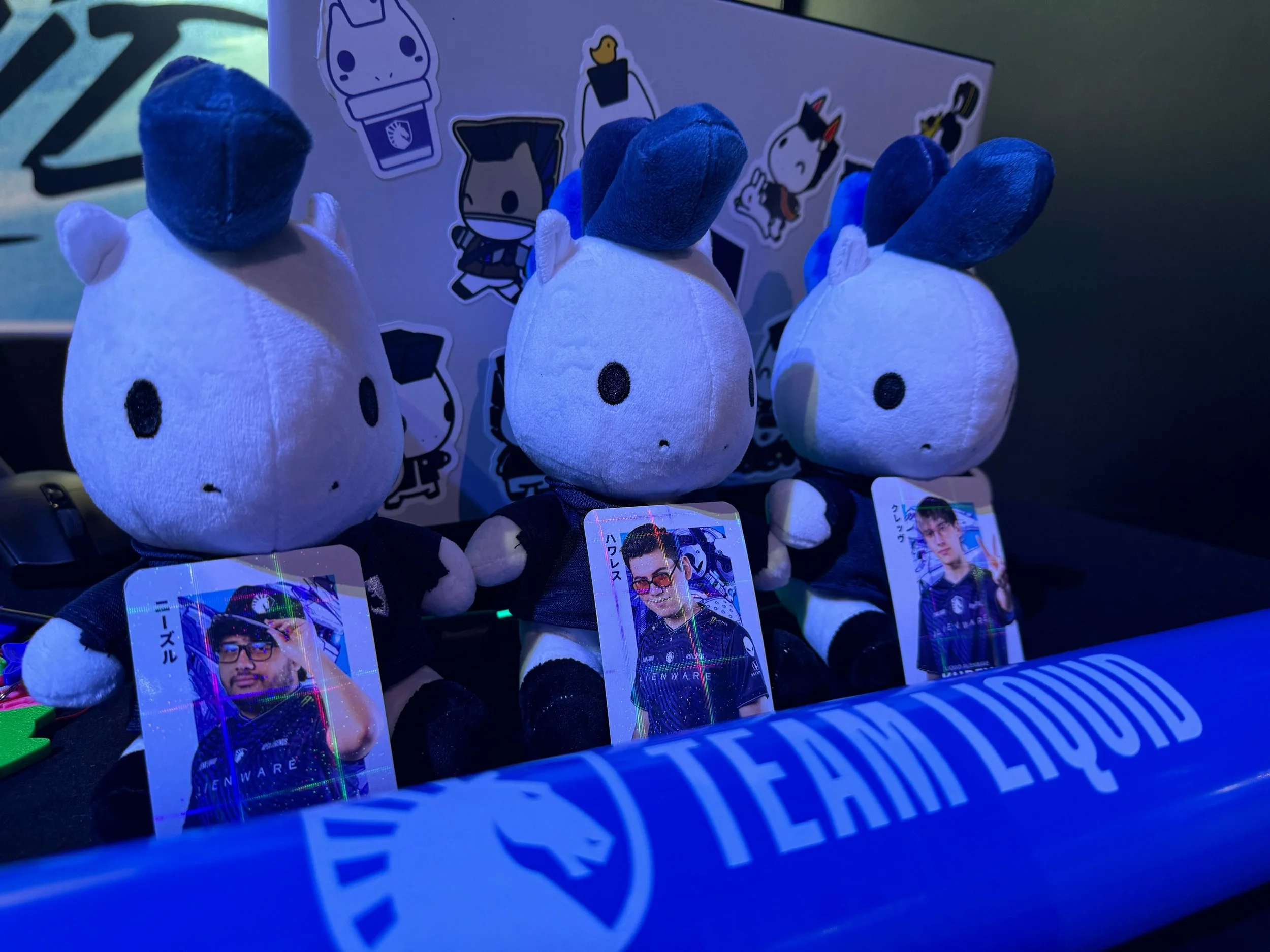
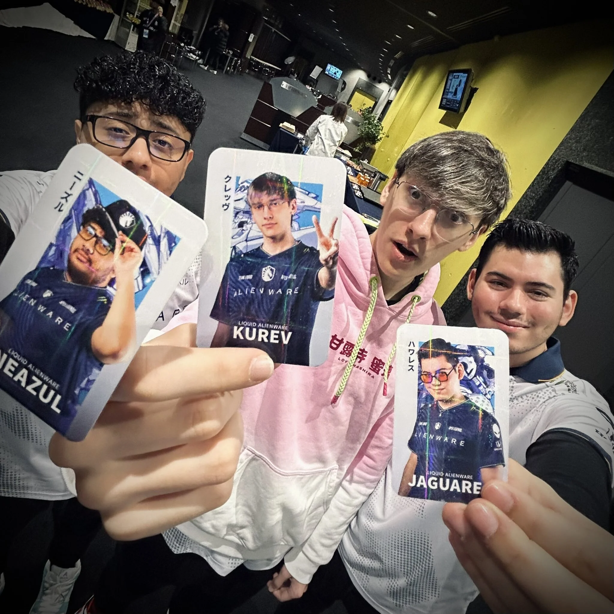
Collectibles
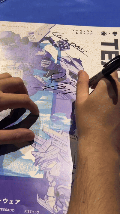
15,000 custom player cards to give away to fans
Memorabilia poster signed by the players
Booth graphics
Digital Items
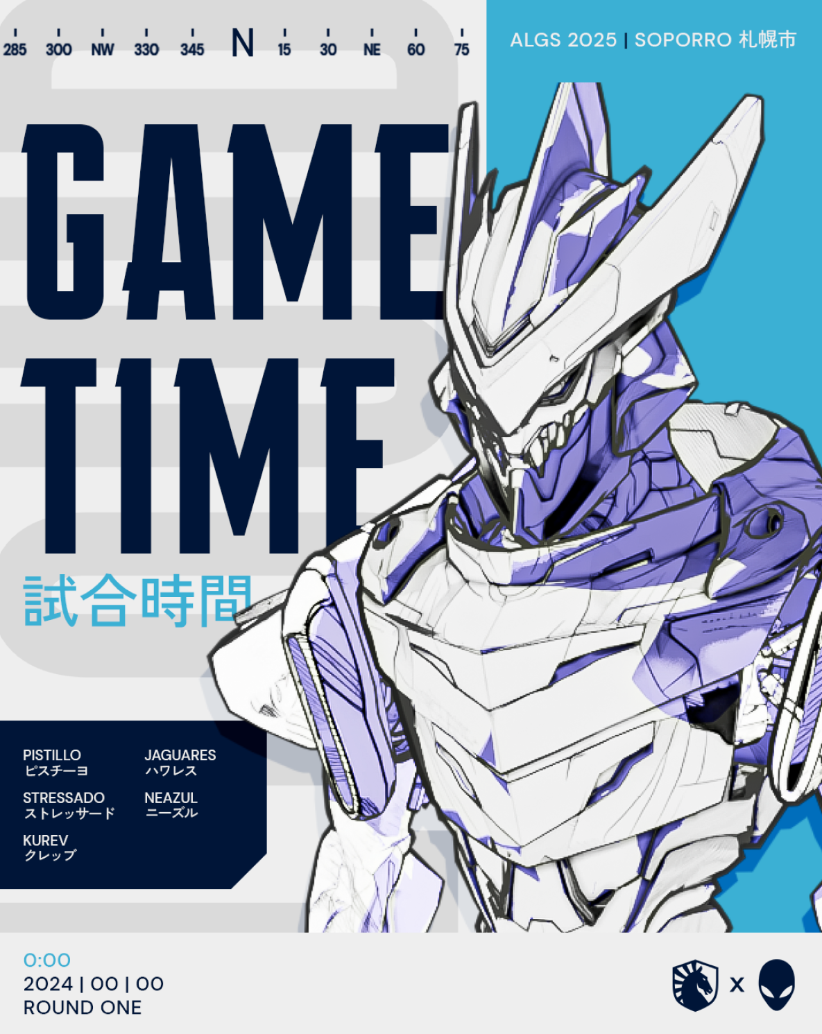
A full set of coverage graphics for pre and post-game scores, stats, and placements
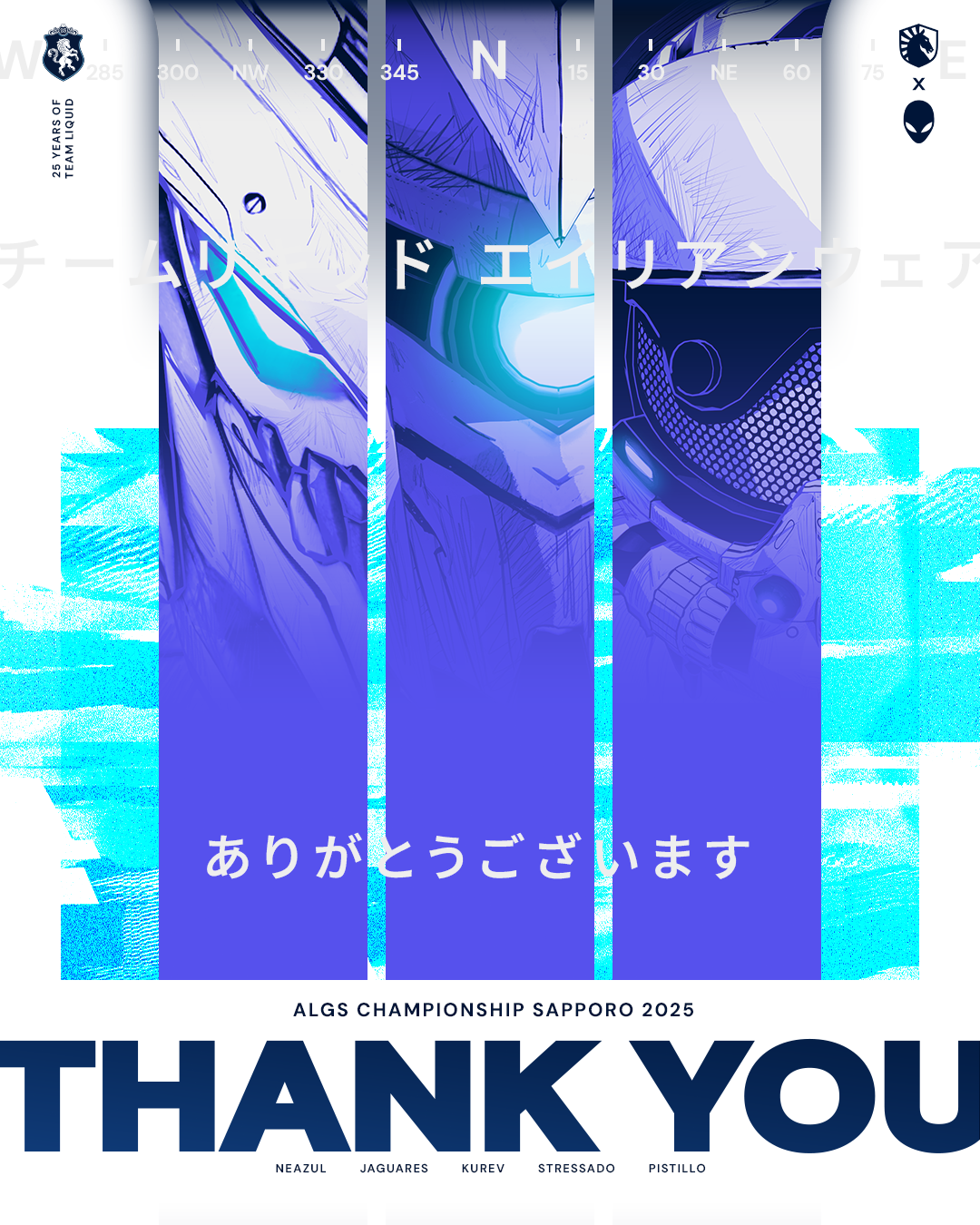
A fan-pack released for free consisting of fully unique desktop wallpapers, as well as mobile wallpapers

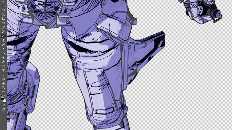
Visual Direction
For this project, we leaned into anime-inspired aesthetics, aligning with the event's Sapporo setting. Bold typography, layered compositions, and intricate micro-details create a premium, collectible feel—something fans will want to share and keep.
Beyond visuals, this project is about engagement. Leveraging content creators and streamers to showcase these designs extends our reach, driving interaction for both Team Liquid and Apex Legends. Win or lose, this campaign strengthens community, fosters loyalty, and expands our presence in new fanbases.
Initial Exploration
During the early stages, we explored different color variations with the renders, but the ones that stood out the most were black and white (before our light source). This high-contrast style gave the visuals a bold, graphic look that felt the most authentic to the anime-inspired direction we wanted to take. To add depth, we introduced a single light source, which naturally created purplish shadows—a technique often seen in anime concept art to add subtle mood and depth.
For the background, we kept things minimal by incorporating simple geometric shapes, representing the framing elements used in anime storyboards (or film blocking references). This helped maintain structure without overpowering the characters or key elements in the composition.
Since animation was part of our vision, we experimented with bringing 2D elements into the 3D world. By placing them in Z-space, we created a parallax effect, keeping some layers in 2D while leaving only the character in 3D. This helped retain the stylized anime look while adding depth.
At one point, we leaned too heavily into complex 2D graphics, adding excessive text. Realizing that less is more, we scaled it back to keep the compositions clear, striking, and true to the anime-inspired style we envisioned.
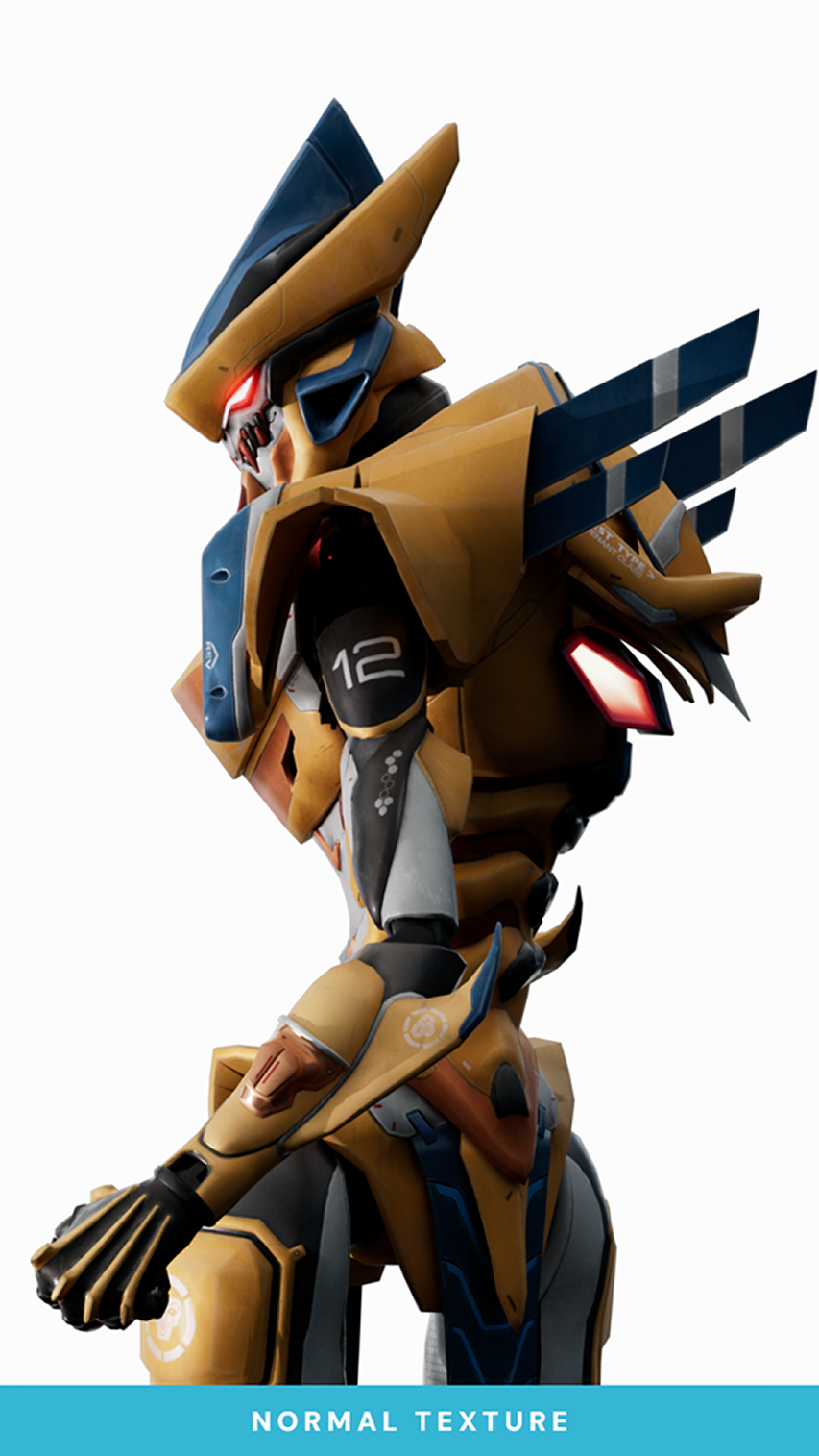
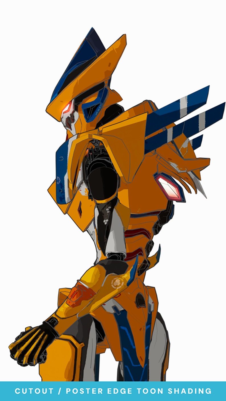
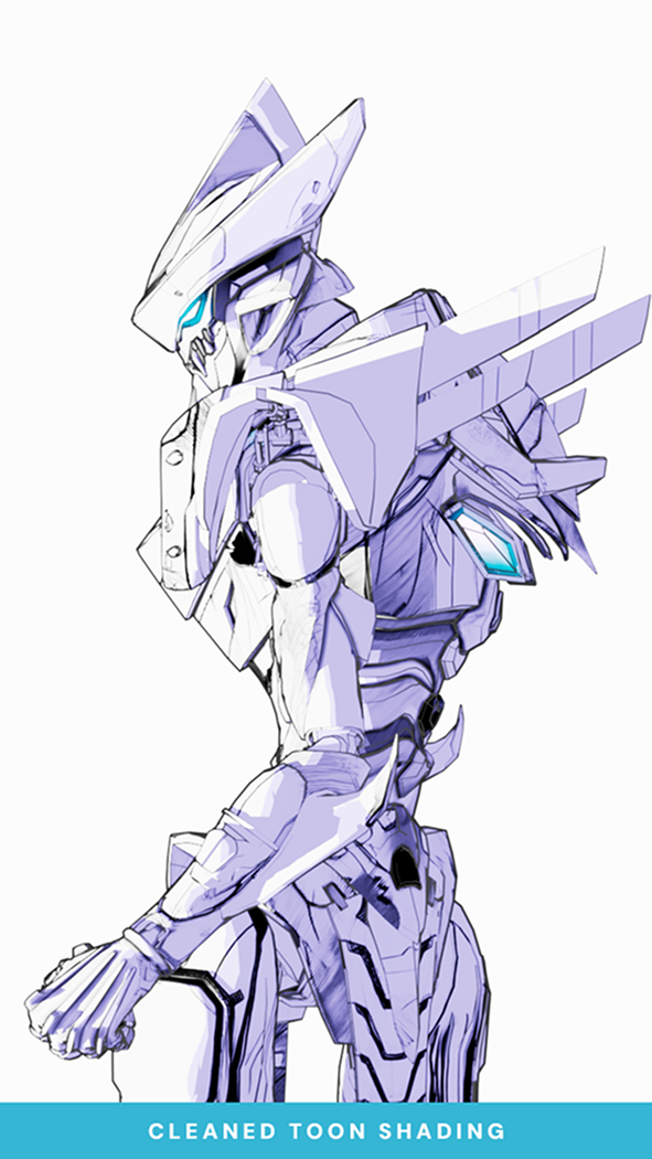
Legend Renders
To achieve the stylized anime-inspired look, we had some help from the 3D legend Tiago. He experimented with different techniques to seamlessly blend 3D and 2D. In order to achieve this effect, he worked with toon shading instead of traditional shading in 3D. This allowed us to create flatter, more graphic-looking renders that mimic the visual style of anime, while still retaining depth and form.
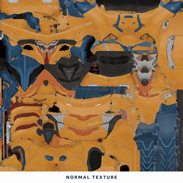
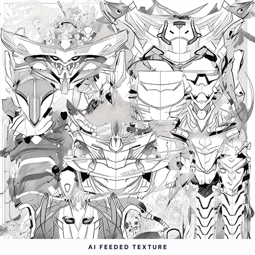
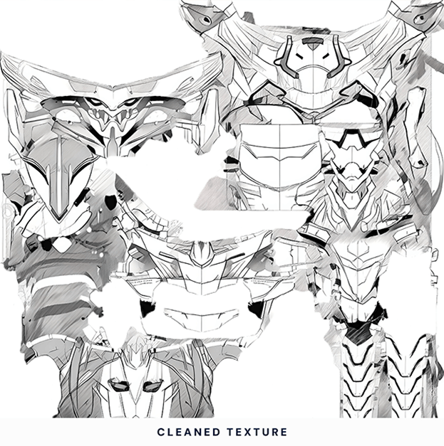
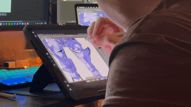
To further refine the look, he fed the characters' textures into AI, using a rough/concept art-style model as a base to generate AI-assisted textures that aligned with the concept art style. While this provided a strong starting point, the results still lacked the natural imperfections and organic feel of hand-drawn artwork. To bridge that gap, we began to meticulously clean up the AI-generated textures, then enhanced them by drawing over them by hand. This final step refined edges, added subtle details, and ensured the final result felt like an authentic illustration rather than a purely 3D render.
By combining toon shading, AI-assisted textures, and traditional hand-drawn refinements, we crafted a unique and polished aesthetic that balanced efficiency with creativity, successfully bringing a 2D anime-inspired look into the 3D world.


Collectibles
For this campaign, we wanted to create something special—exclusive player cards designed like collectible trading cards, inspired by Pokémon and Magic: The Gathering. But the best part? We gave them away for free! And not just that—each card was signed by the players, making them an unforgettable keepsake for fans.
Alongside the player cards, we also had other freebies and exclusive posters, also signed by the players. The response was incredible—fans couldn’t believe they were actually getting these for free, and the excitement around the collectibles made this a huge success. It was amazing to see how much the community appreciated these pieces, turning them into true TL memorabilia.


Digital Items
Coverage Graphics
To introduce this new visual identity, we wanted to fully embrace the anime-inspired concept from the start. We felt the best way to do this was through an animated opening post—done by Tiago—setting the tone for the rest of the tournament. This approach allowed us to highlight the unique fusion of stylized 3D and hand-drawn 2D elements while drawing inspiration from Japanese aesthetics—one of the core influences behind this campaign.
For the rest of the coverage graphics, we chose to keep them static to maintain balance. Animating everything would have been excessive, and we wanted the strong compositions, bold typography, and intricate designs to stand on their own.
Unfortunately, Team Liquid finished in 6th place, meaning we never had the chance to use our Champions graphics in the live campaign. However, we’re excited to share them here exclusively, so you can see the full scope of the visual work we put into this project.
This campaign was more than just coverage—it was about bringing a fresh, stylized take to Apex Legends esports, using anime and concept art-inspired visuals to create something truly unique for the ALGS Championship.


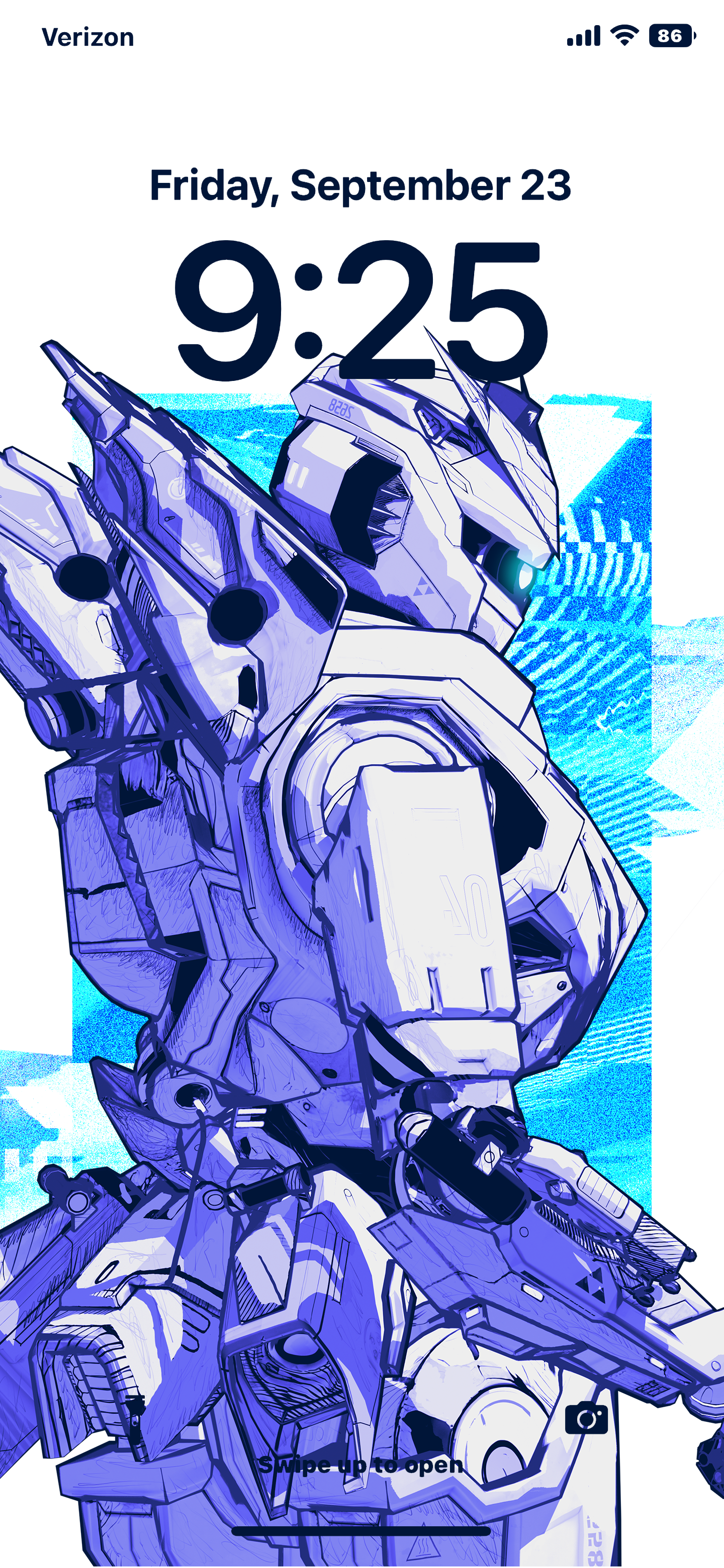

Fan-Pack
We knew from the start that this visual style would be a hit—fans and players would want these wallpapers, and honestly - so did we! As such, we created a digital fan pack that included both horizontal wallpapers for desktops and vertical wallpapers optimized for phone displays.
This was our way of letting the community take apart in this campaign - bringing the anime inspired Apex visuals outside of the game, and beyond the competition to be enjoyed by the fans.
Check out the full project on Behance!

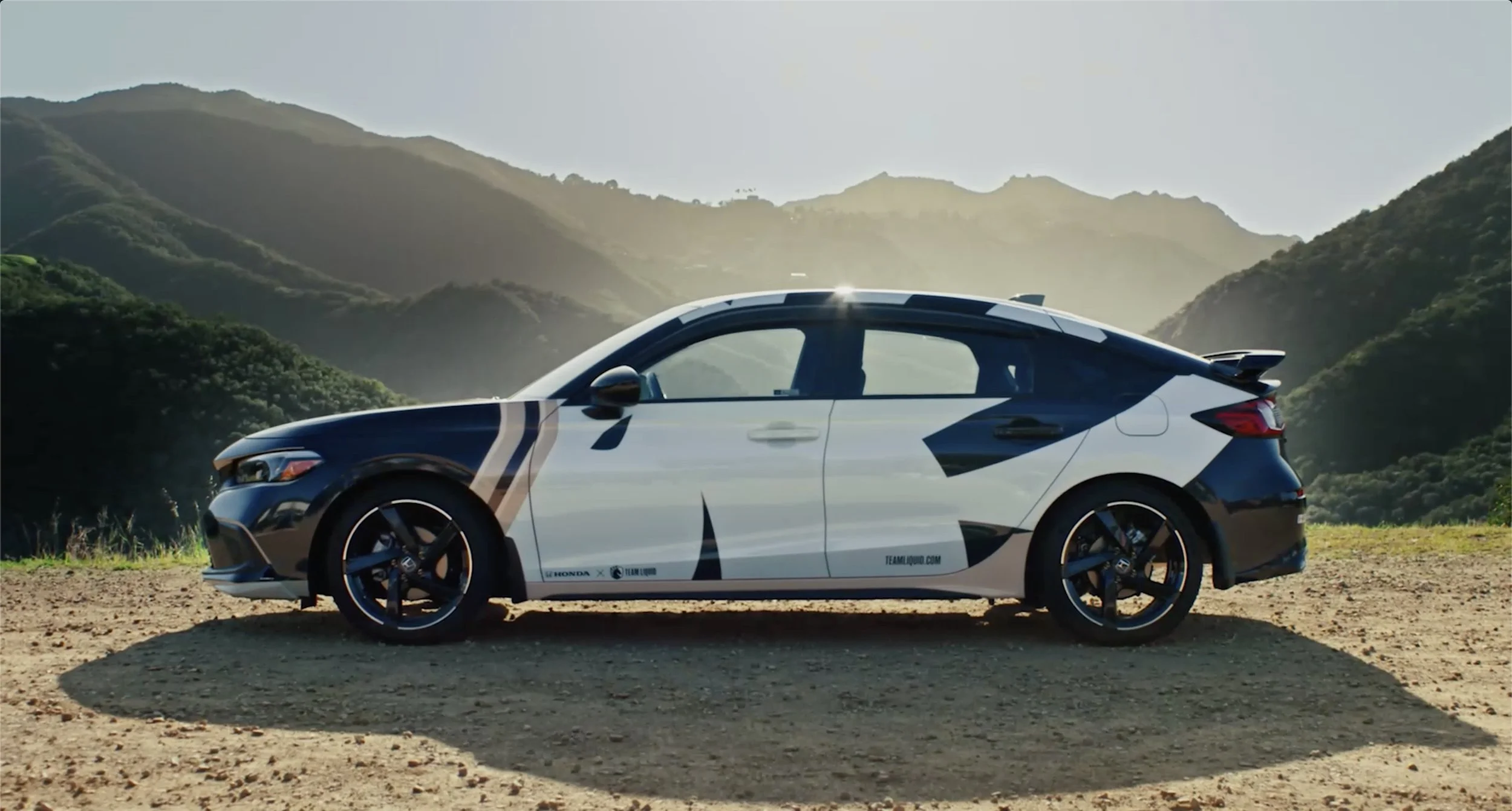
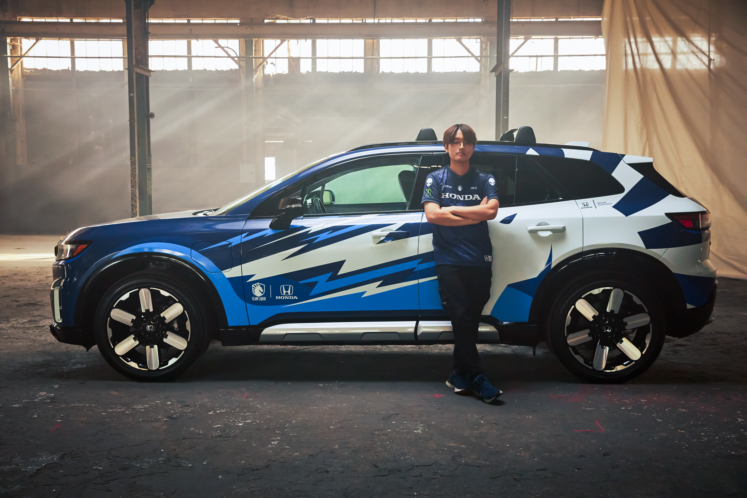
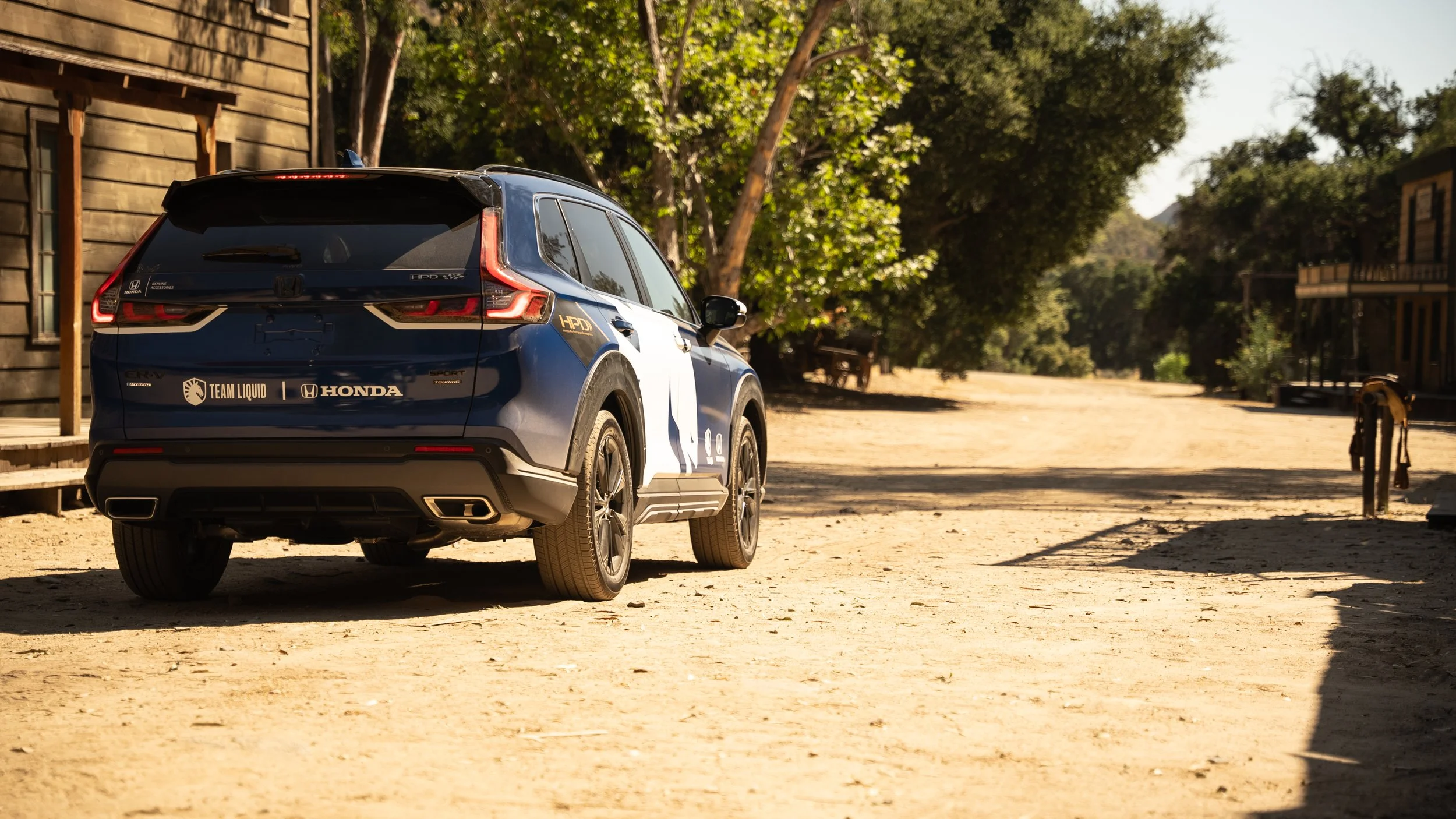
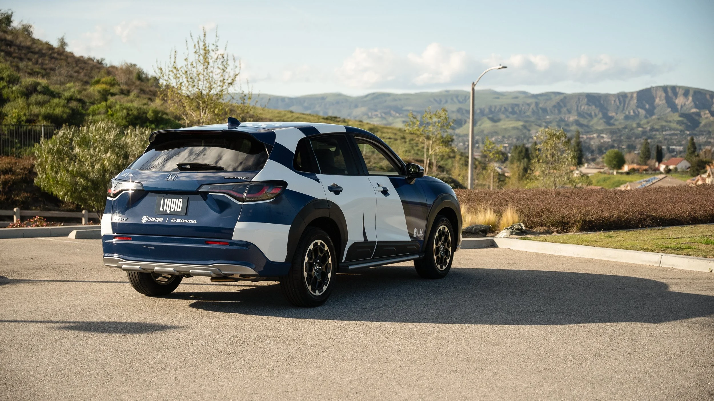
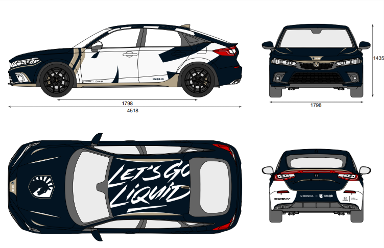
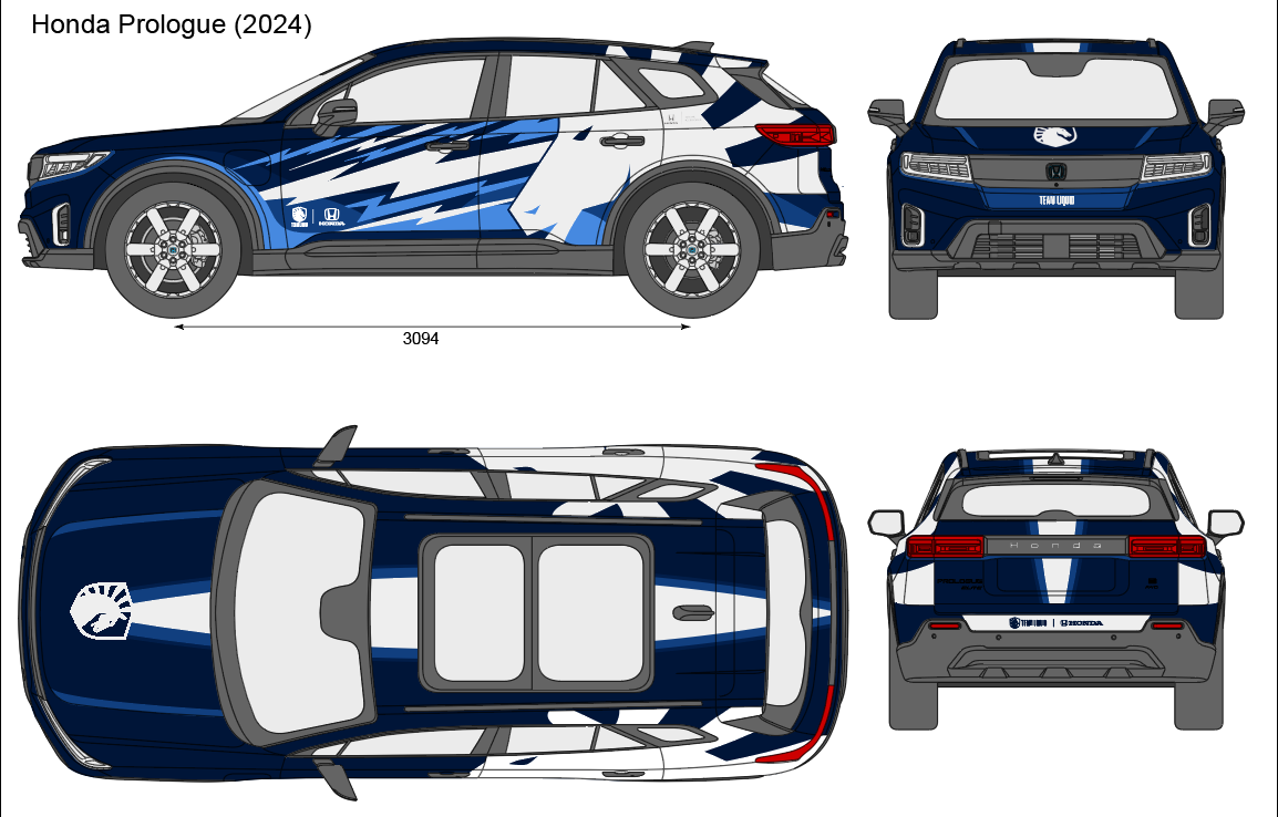
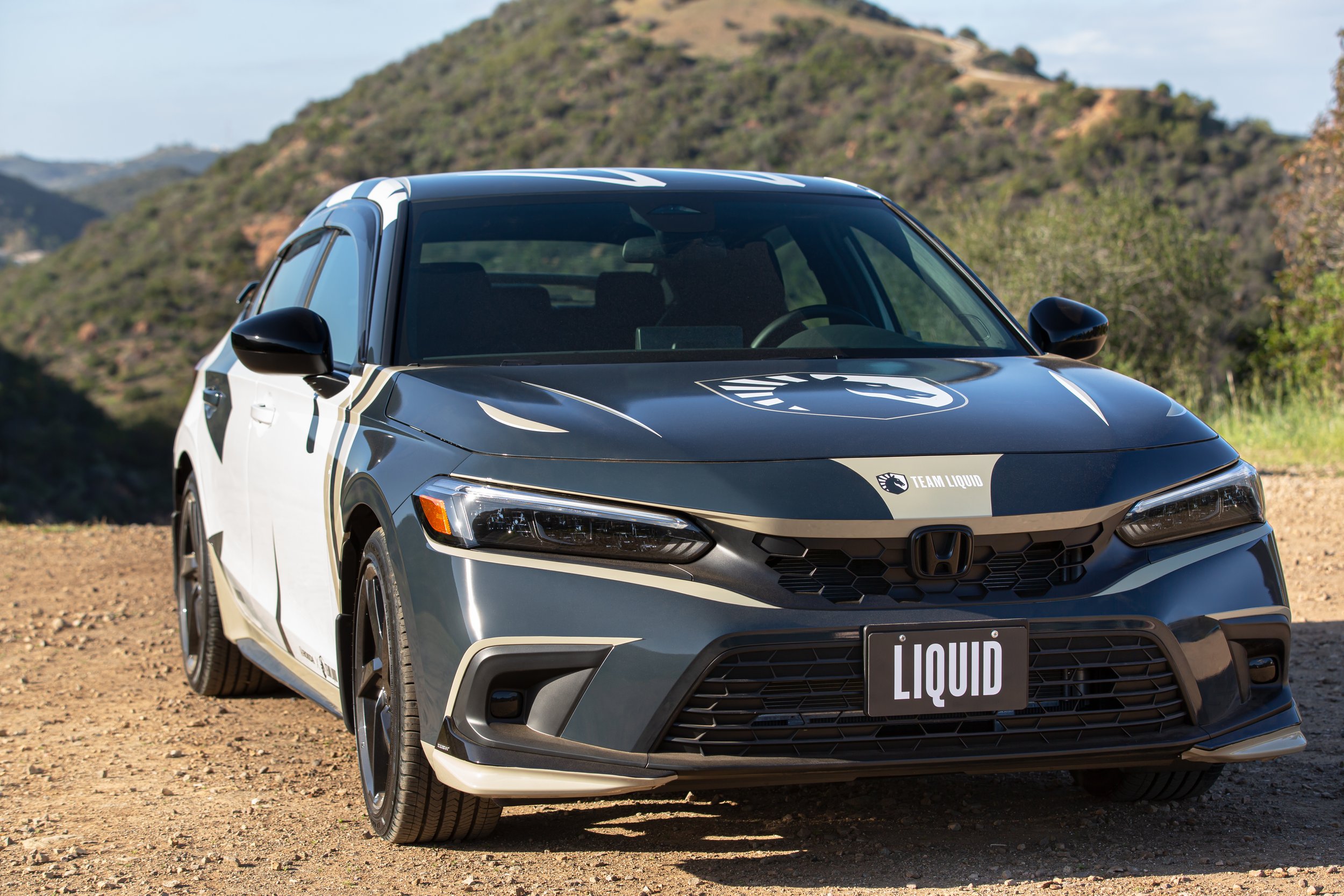
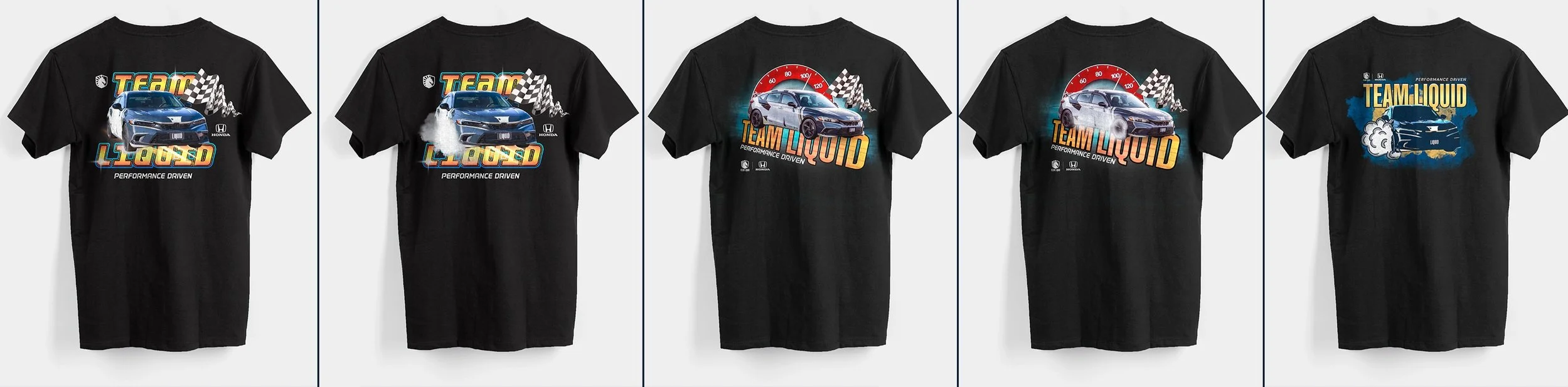
Honda Car Wraps
Through partnership between Honda and Team Liquid, we were tasked with creating vehicle wraps and T-shirts for the last few years, with a new vehicle each year. Check out the process below!
Design Process
Initial Discussions | Concepts | Photo-Realistic Mockups | Final Photos and Videos | Real World Products |


Initial Discussions
When starting to brainstorm the car wrap, we often spend hours looking at photos of the car before doing anything design-wise. we study the natural body-lines, fender flairs, and ways to make a design work with the overall shapes of the car.

Concepts
After the initial brainstorming, it’s time to start the design process! We head over to Adobe Illustrator to begin the concepts. Listed here are some of the final concepts created for the various wraps before sending off to the wrap / detailing company.
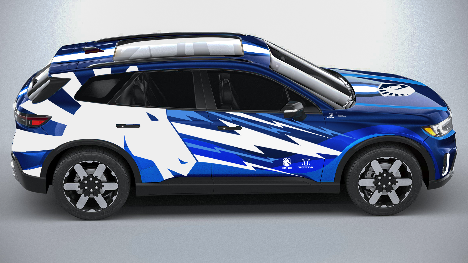


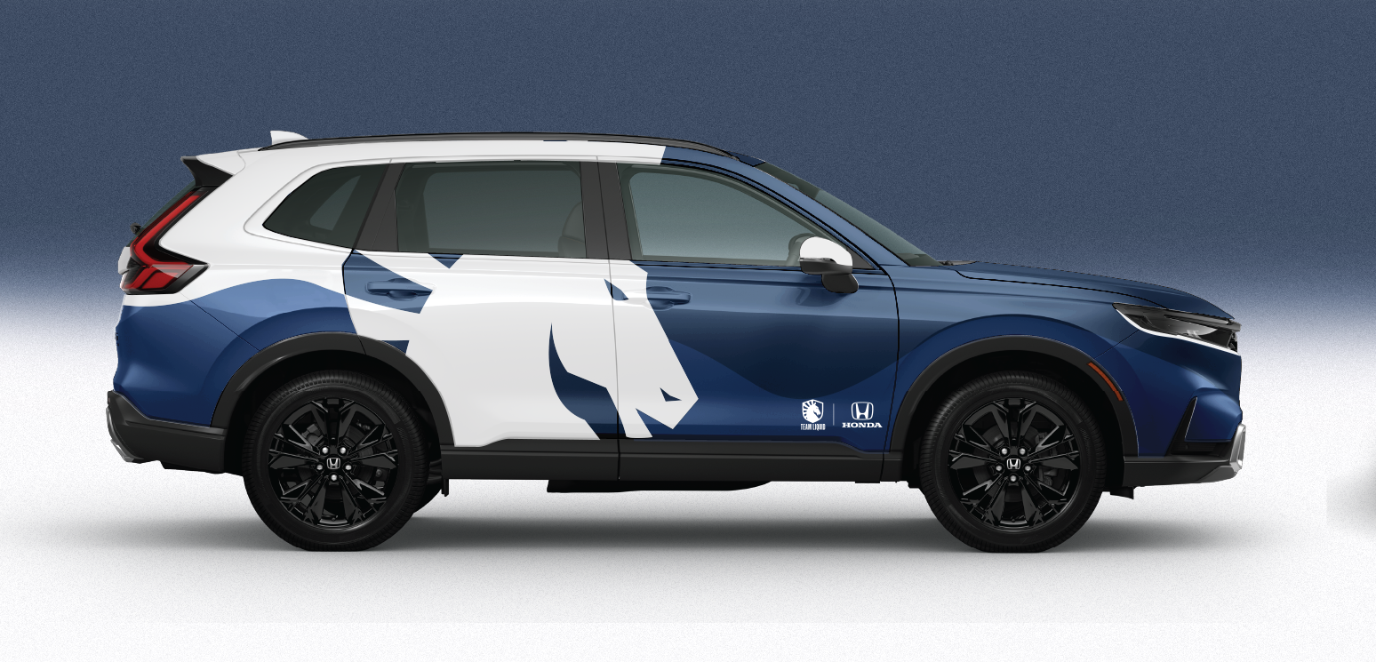

Photo-Realistic Mockups
After the base designs are to a point we’re happy, we head over to Photoshop to give the renders some life. Although the concepts above portray a nice picture of the overall design, nothing quite beats real world applications. Having a sense for how the wrap will look on the car in natural lighting and in the real world is vital, as it allows the marketing teams from Honda to gain a better picture of what the final product will look like.
Final Car Wraps
Below are collections of the final car wraps from over the years, and a collection of commercials featuring the car! Models include a Civic Sport, HRV, CRV, and the Prologue.


Commercials
Honda also shot many commercials featuring the cars for television, streaming sites, and more. Check those out below!
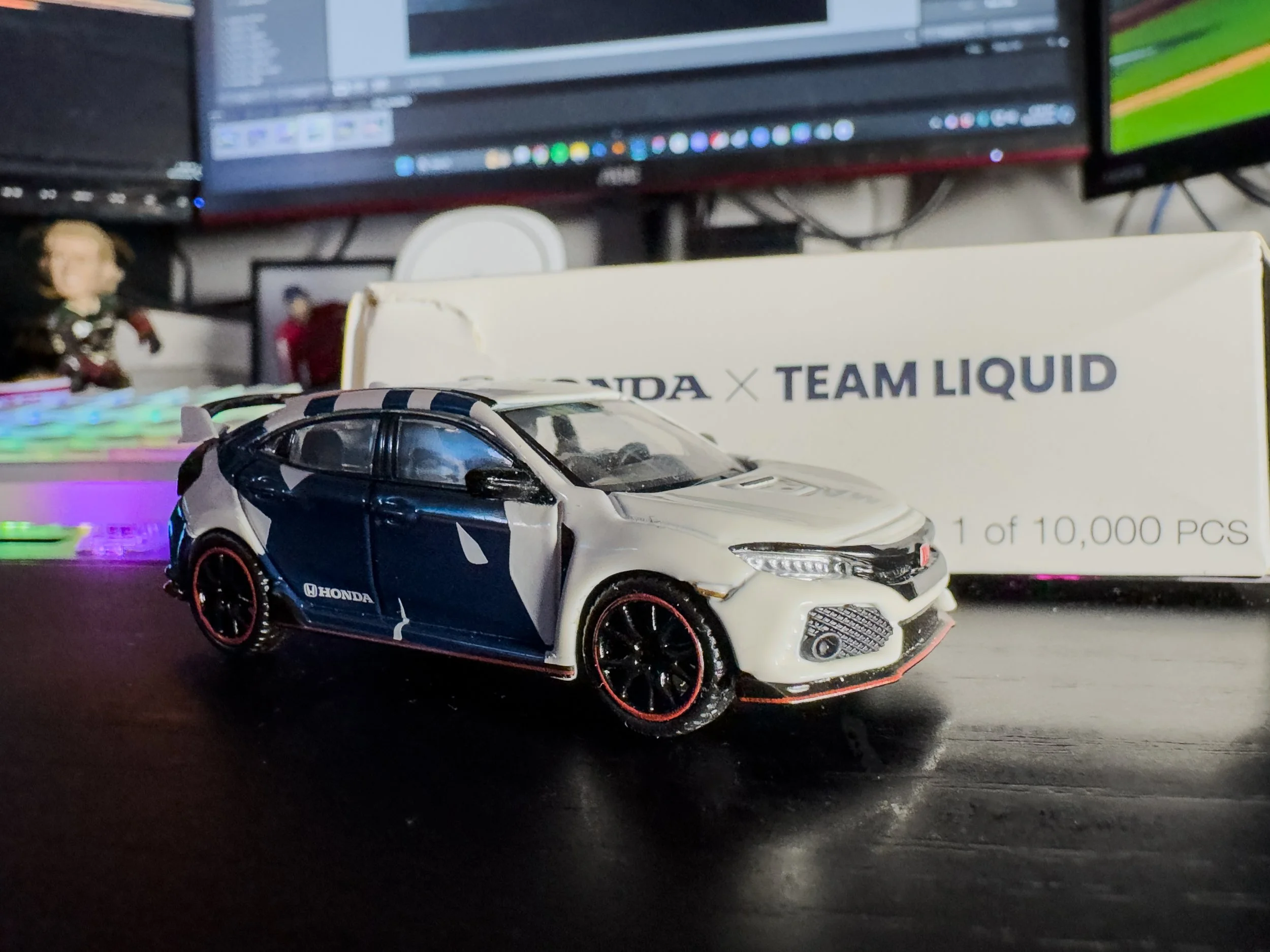
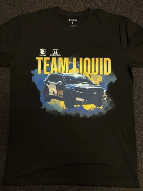
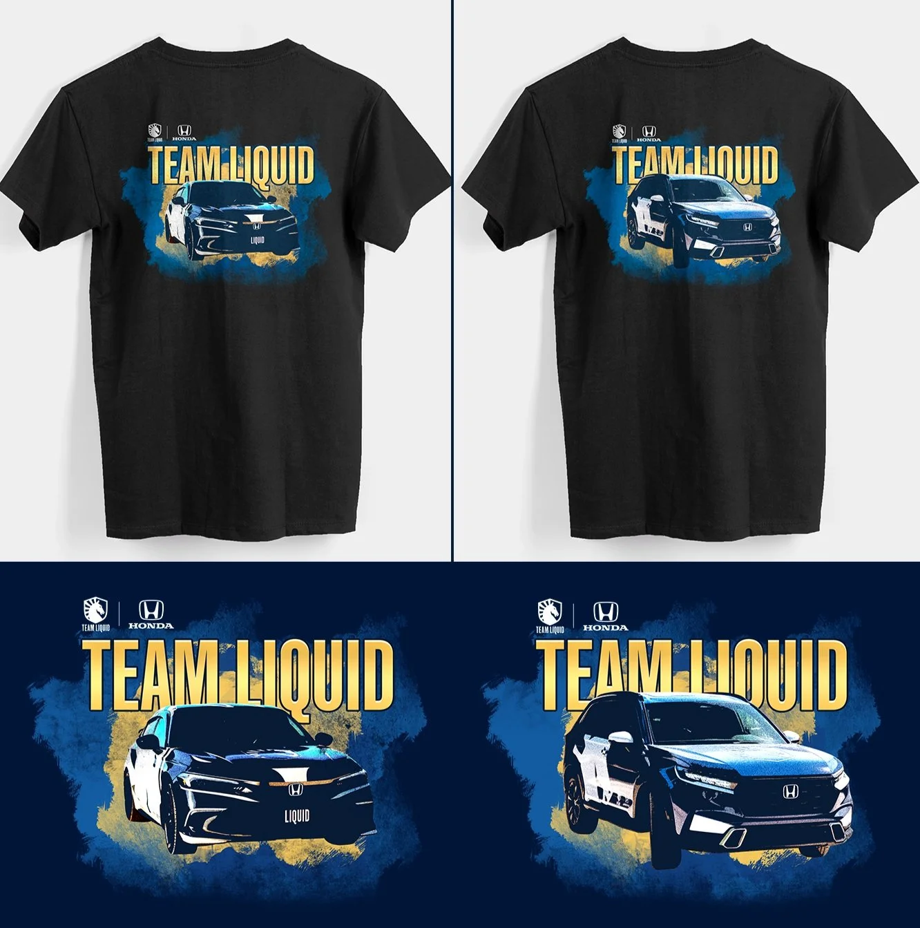
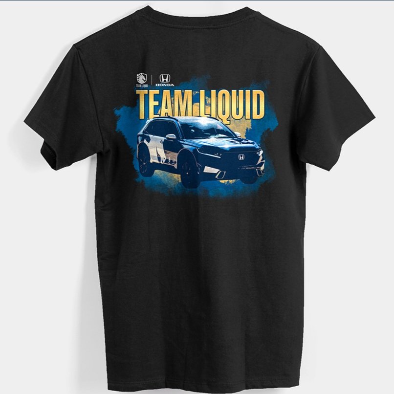

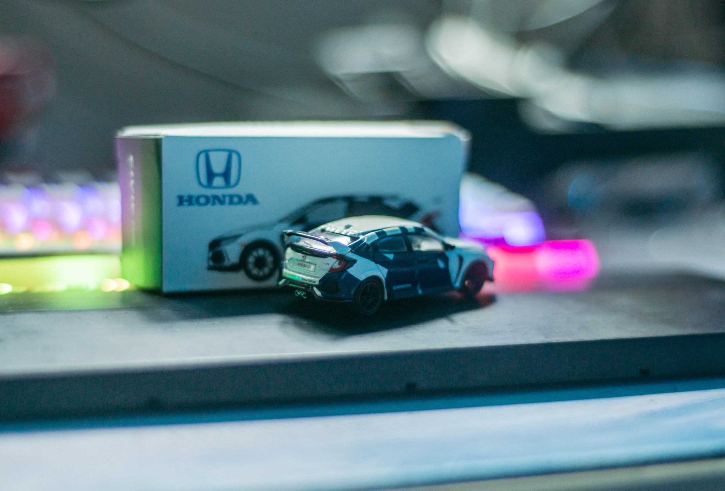
Collectibles
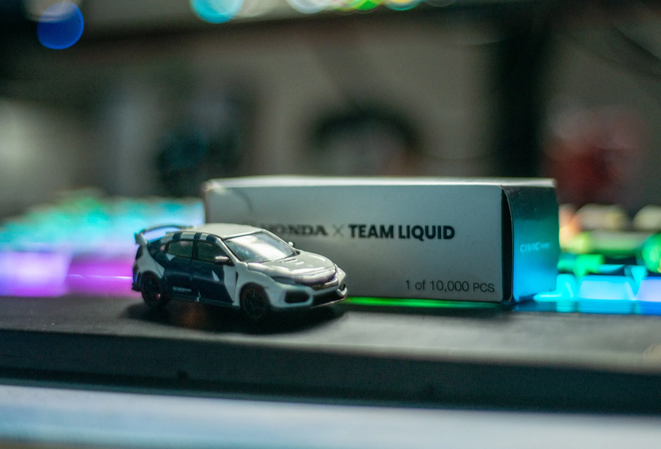
Together with Honda, we designed a T-shirt around the new HRV and Civic! This t-shirt was designed to be sold at TwitchCon for 2023. There was also a matchbox car that was created to be given out at the League of Legends Championship for 2022! Luckily, one of my good friends on social media snagged us one knowing we would love to have a model.


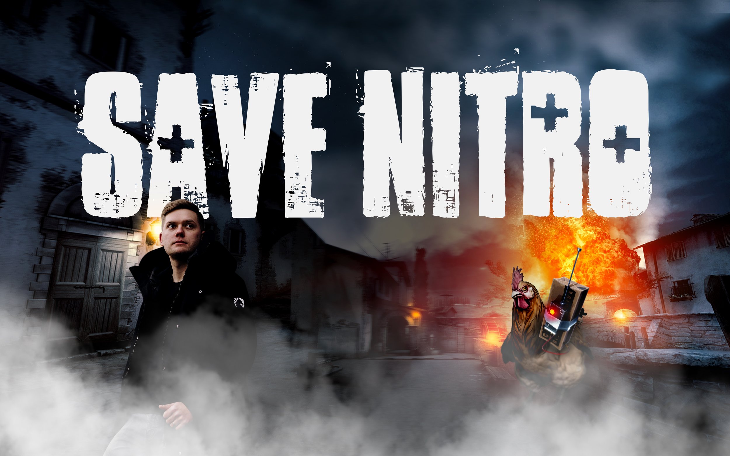
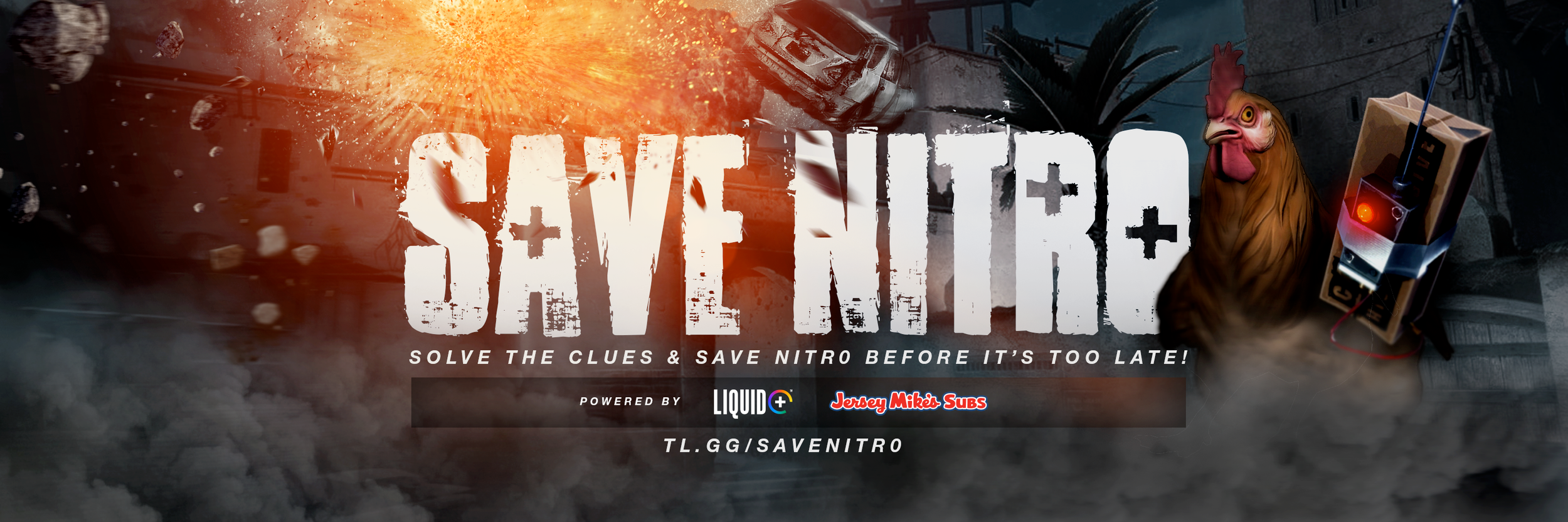
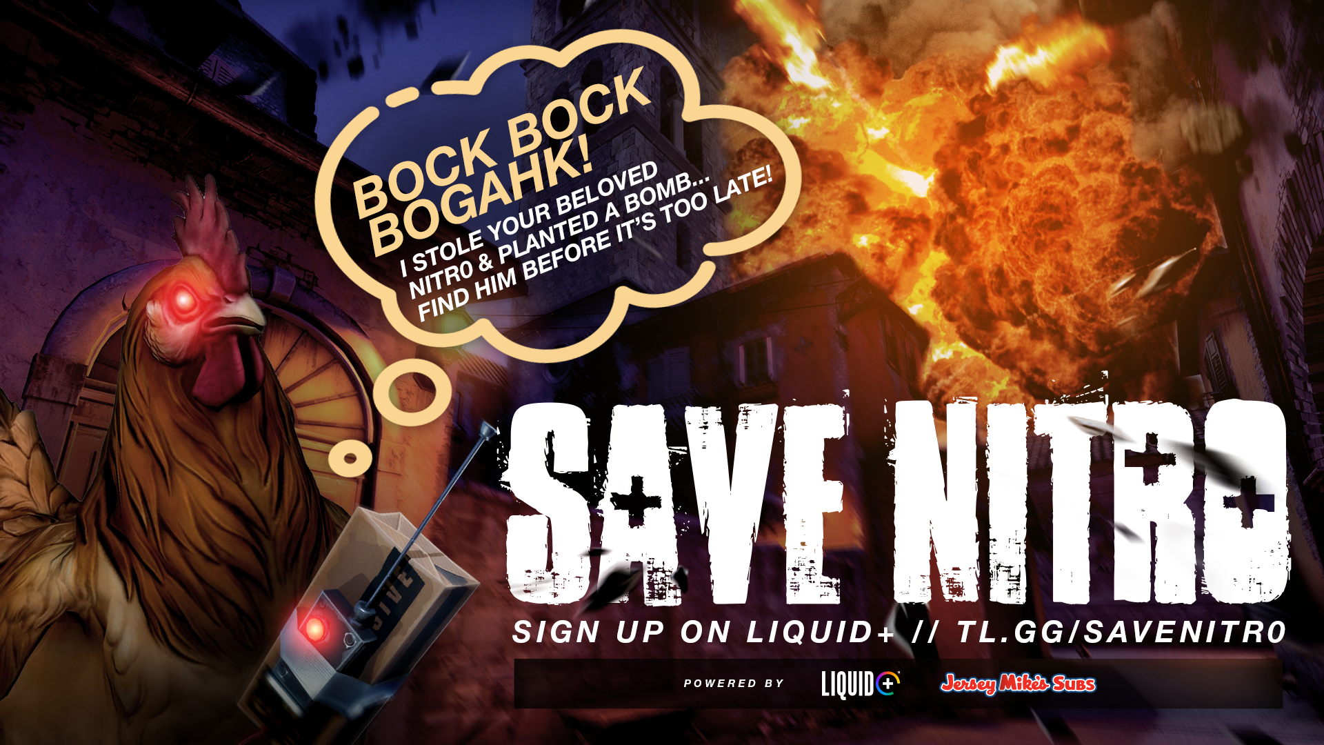
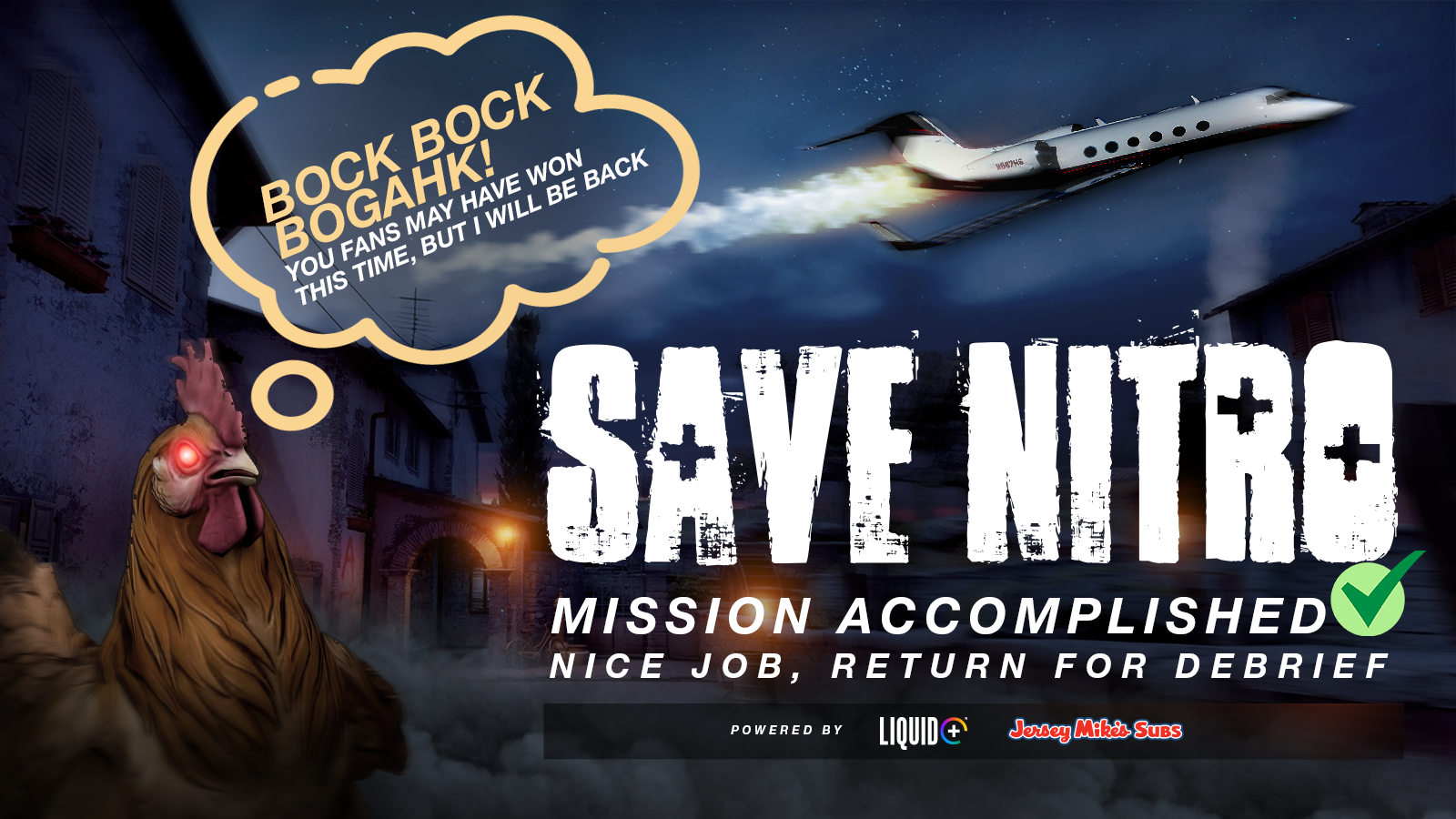
Save Nitr0 Campaign
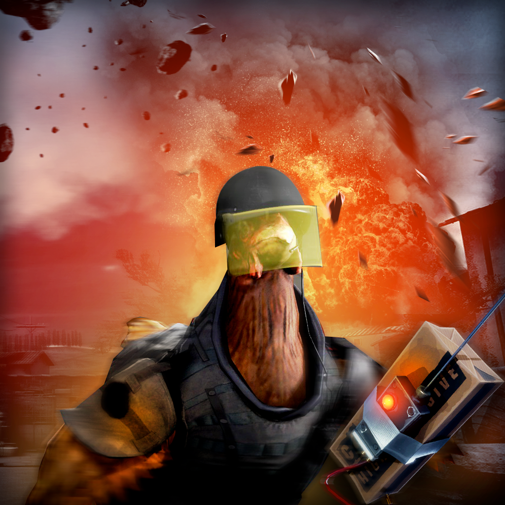
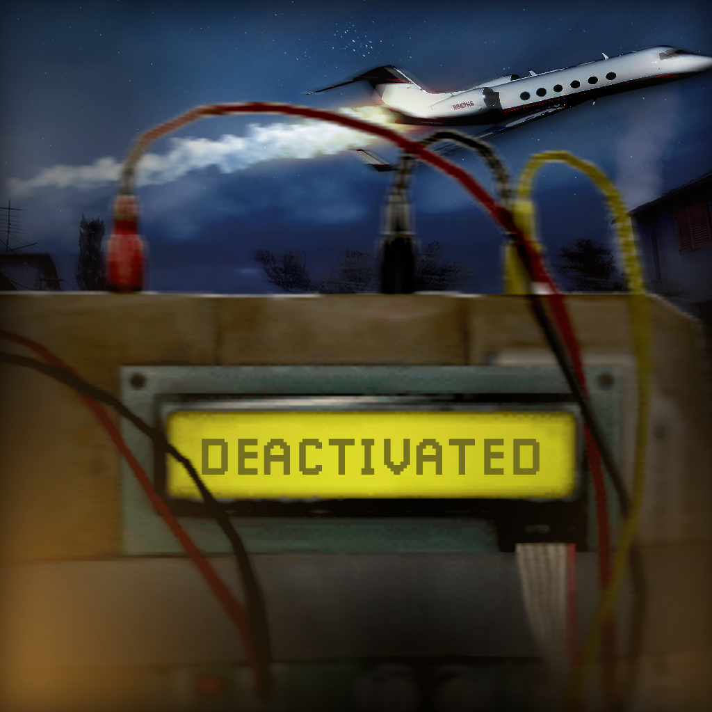
Save Nitr0 was a campaign involving fans working together to save the professional CSGO player Nitr0 from the pesky chicken who has kidnapped him and taken him hostage. Fans must come together to solve a weeks worth of clues and riddles in order to defuse a bomb located in a mystery location before it is too late!
Asset Breakdown
-
Twitter, Facebook, Instagram posts.
-
Sponsored posts for Twitter, Facebook, and Instagram to drive new fans to participate.
-
Twitter, Facebook, and YouTube banners and profile pictures for the event.
-
This is where we host the event. Assets included various icons, a homepage, reward images, prizing images, and various clue images as fans solved clues, including a spot the difference game…have fun below!


The Announcement & First Clue
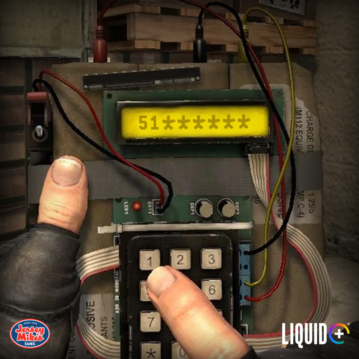
We kicked off the announcement with a cryptic message from the bomb toting chicken himself, alerting fans that he has kidnapped the beloved Nitr0, and fans must sign up to take part on the Liquid+ website.
Shortly after, fans received a text message from Nitr0 giving the first hint to save him. Fans must begin searching for the code to disarm the bomb. Problem is, the numbers are scattered about on a famous CSGO map, Inferno! Play along, if you dare!

Following the Clues
As the days went on, more clues were released to the fans to solve the code, disarm the bomb, and save Nitr0. The second clue was a simple spot the hidden letters game. Feel free to enlarge the photo and try yourself! Third, we introduced a very challenging spot the difference game. As some breezed through with the eyesight of an owl, others struggled a bit to gather the clues. Although challenging, many fans worked together to ensure they have the right bomb code. If not, Nitr0 will remain on Inferno in the hands of the evil chicken! Think you can spot the differences yourself? I’ve added an answer key to the bottom of the page. No cheating!!
Game time! Here’s how to play:
Within the two photos below, there are differences in objects on the map, elements, changed, removed, added, etc. Spot all the differences, and the total number of differences you were able to spot are the final two missing numbers to disarm the bomb and save Nitr0!


Social Media Coverage
Throughout the campaign, strong marketing was a must. We ran paid media ads (sponsored posts) across Facebook and Twitter. As mentioned in the asset breakdown panel, we also tackled Twitter and Facebook banners, as well as profile pictures.


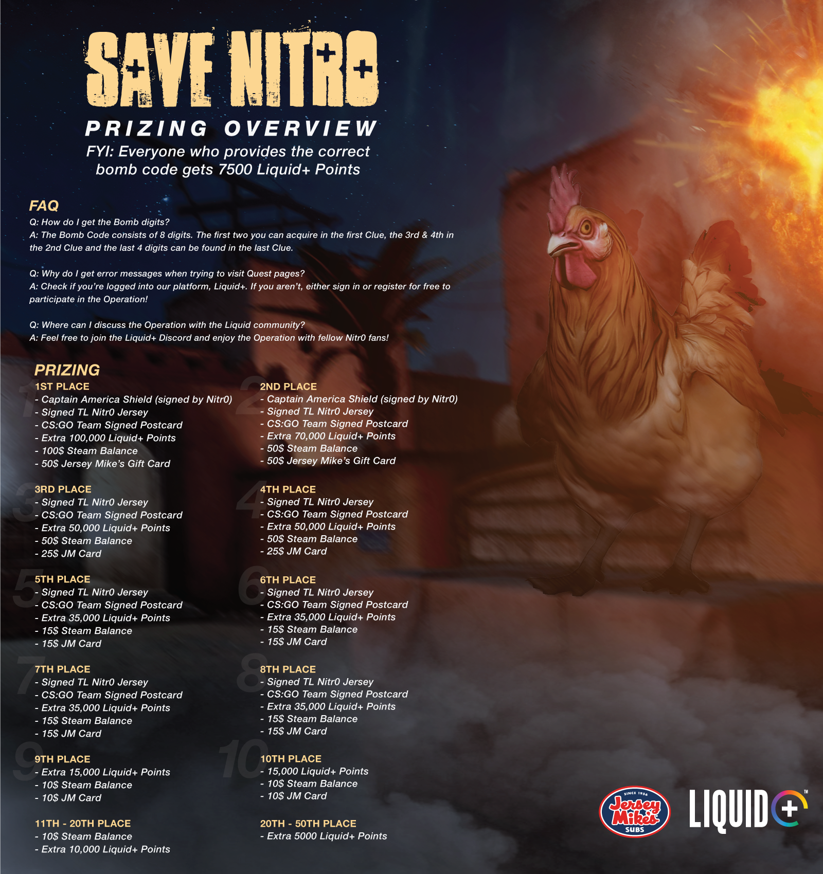

Liquid+
This is the “main hub” so to speak, where fans will interact, submit their clues, and track their progress. Assets for this include a background for the main event, reward images, icons, and an achievement icon.
What is Liquid+?
Liquid+ is a community based site where fans can gain points for watching streams, taking part in events, and more. Those points can then be redeemed in a store for physical goods such as t-shirts, posters, signed jerseys, etc.


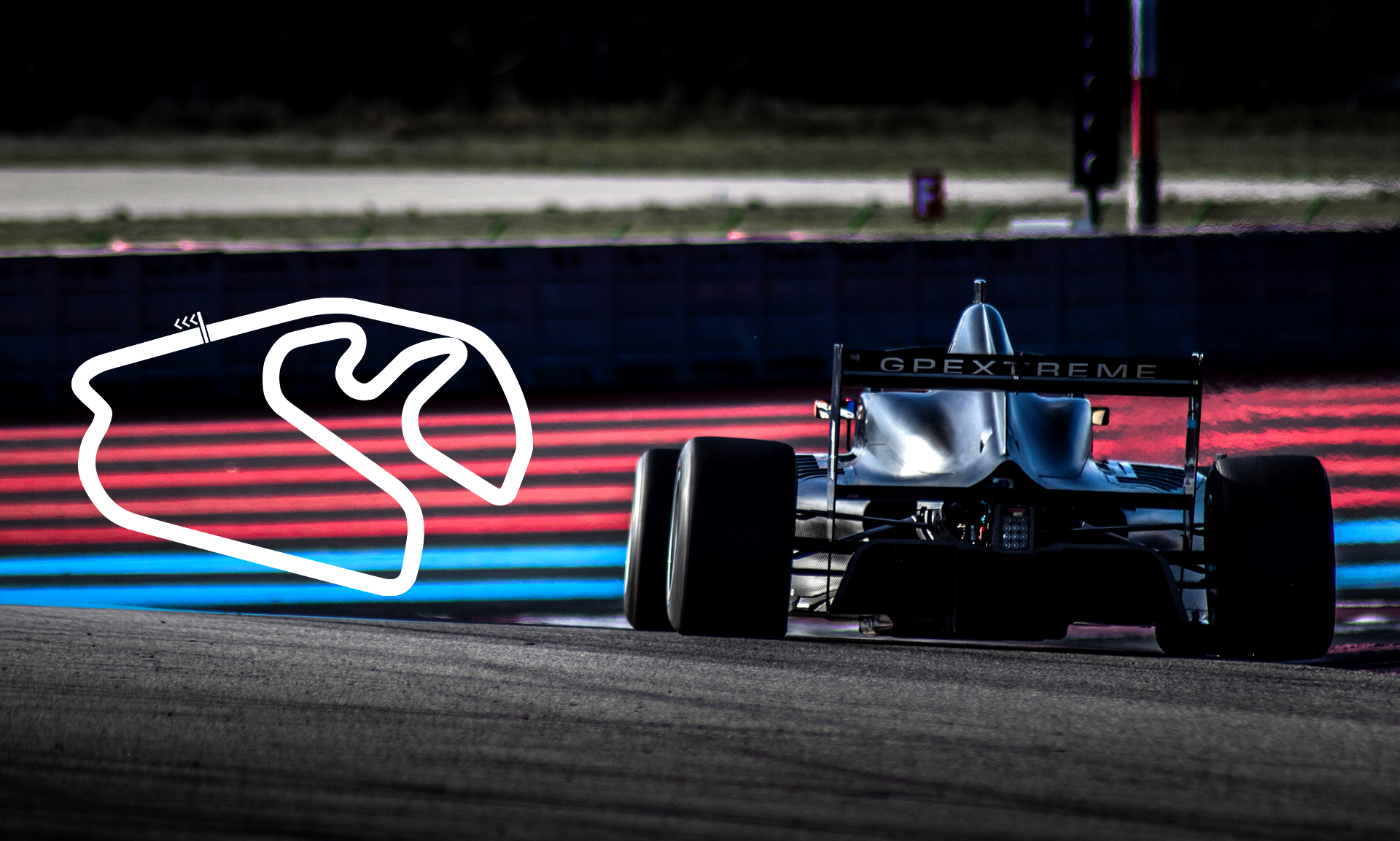
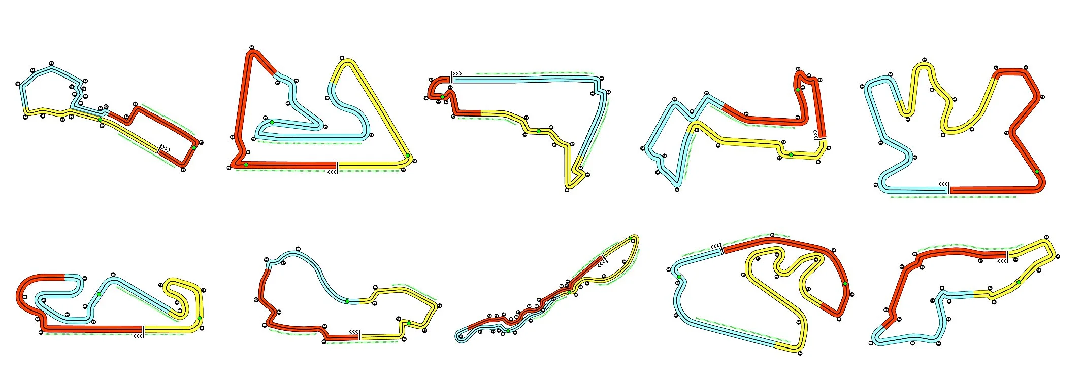
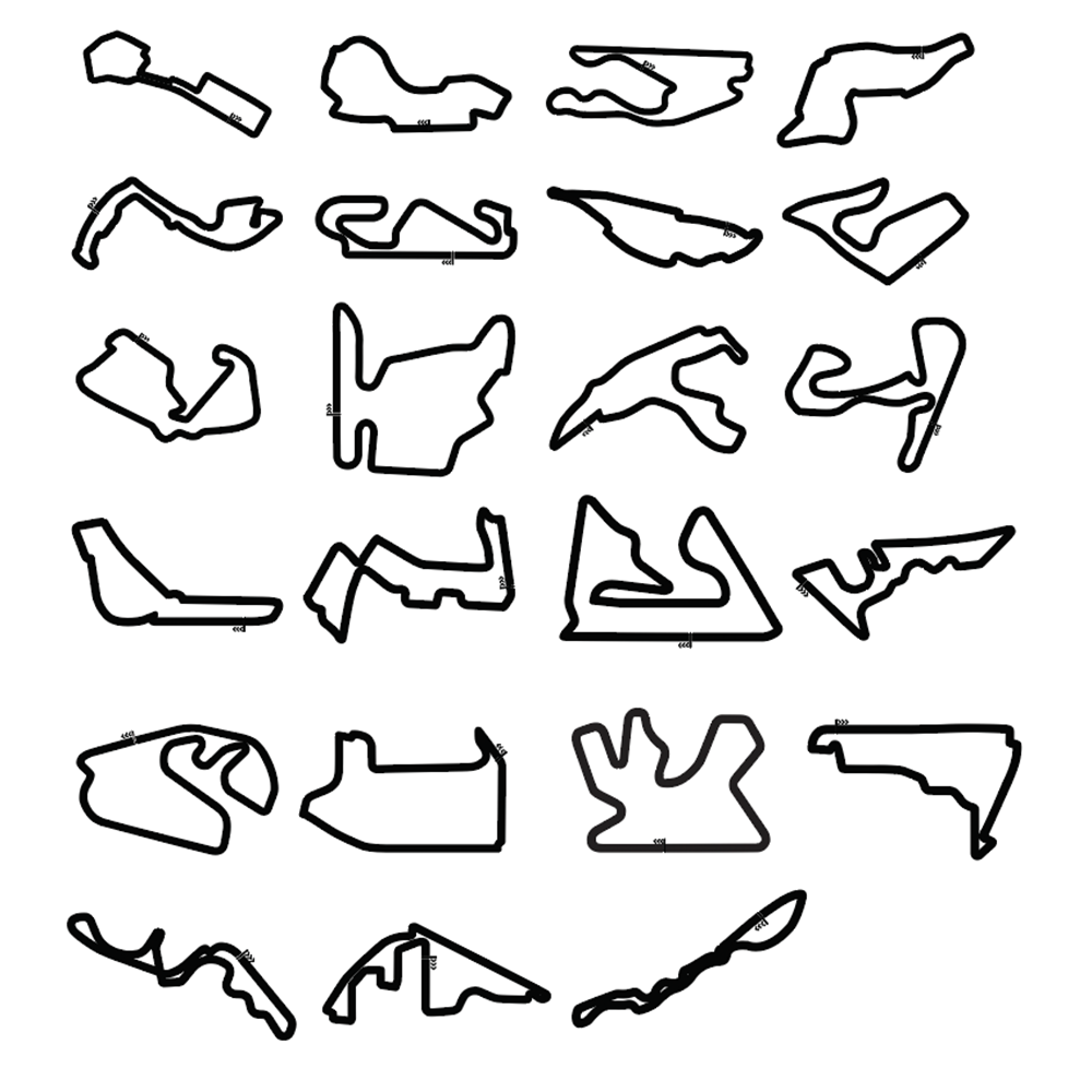
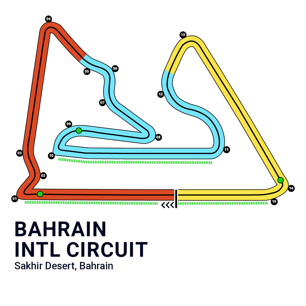
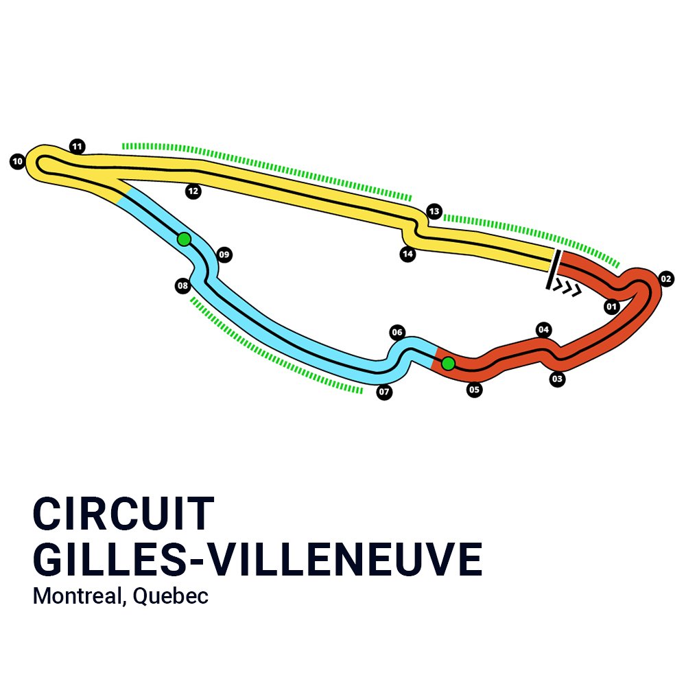
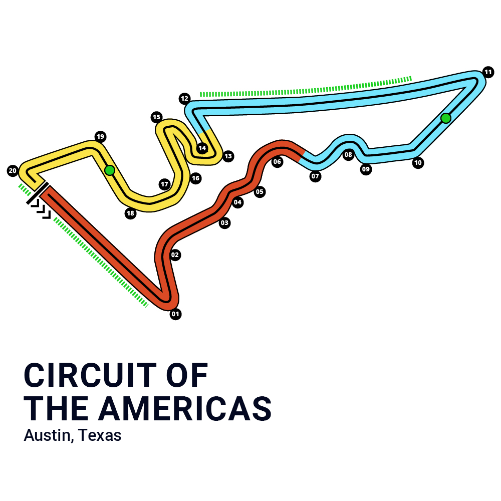
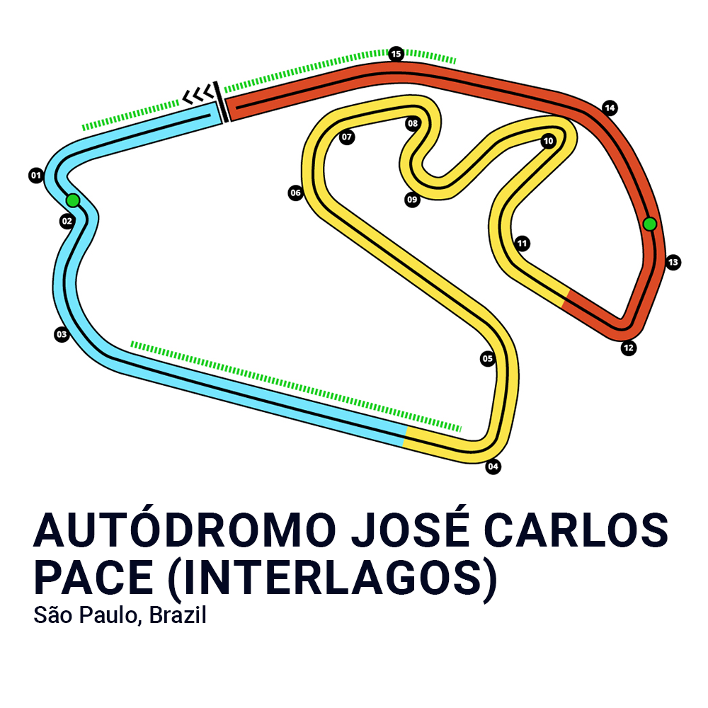
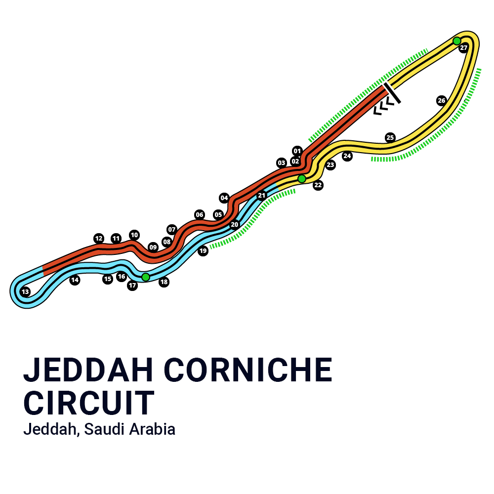
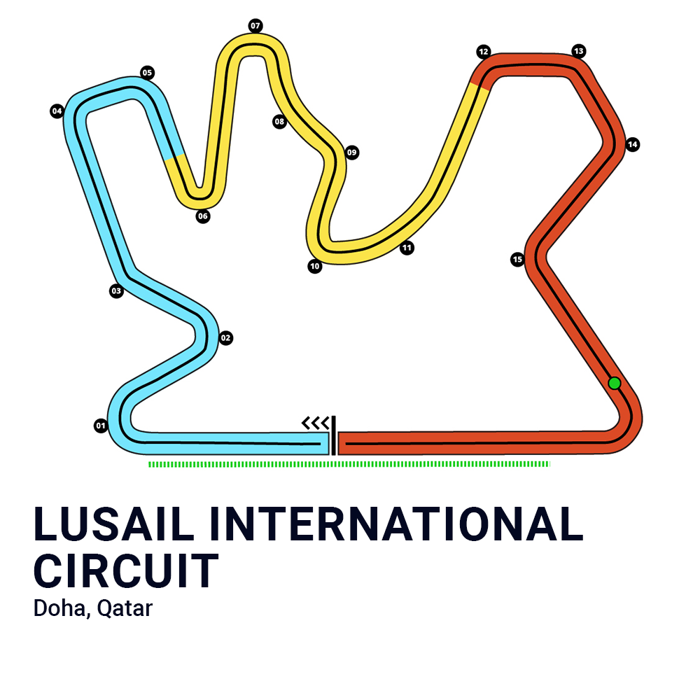
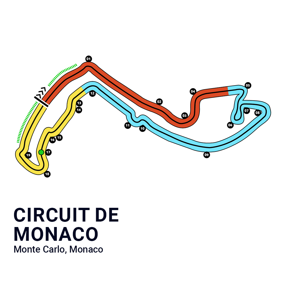
Liquidpedia F1 Expansion
Liquidpedia is a Wikipedia for esports. This year, they reached out regarding their expansion into Formula One coverage. On the graphics side, the task was quite expansive; create a visually appealing but informative outline of each and every current F1 track being raced this year. Enjoy!

Gathering Intel
Within the realm of Formula One, the creation of a track layout is a balance of accuracy and visual appeal. It's essential to consider the viewer's perspective and strategically incorporate key elements into the design, all while staying accurate to the historical nature of each track. Every curve, straight, and chicane should not only adhere to that historical nature, but also resonate with viewers' emotions.
With that being said, I embarked on an extensive coffee filled night, and scoured the internet for various iterations and innovative visual approaches. My quest was to recognize what resonated not only with myself, but also with the passionate fan base of esports and Formula One. This exploratory phase forms a base for the creative process. Now, time for concepts.
First Iterations
During the concepting stage, we had many different ideas in mind of how to visually approach the tracks. Obviously, the layout of the track itself is set in stone. Figuring out the colors that work best, the thicknesses, smoothness, and factoring in light and dark modes was, however, a challenge.
The overarching goal was for the tracks to be visually appealing, colorful, but not too childlike, and easily understandable and identifiable from an avid F1 fan.

Closing In
After many different concepts were created, we settled in on a direction we were all very happy with, and fleshed out more of the creative needs from there.
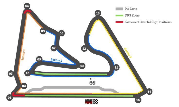
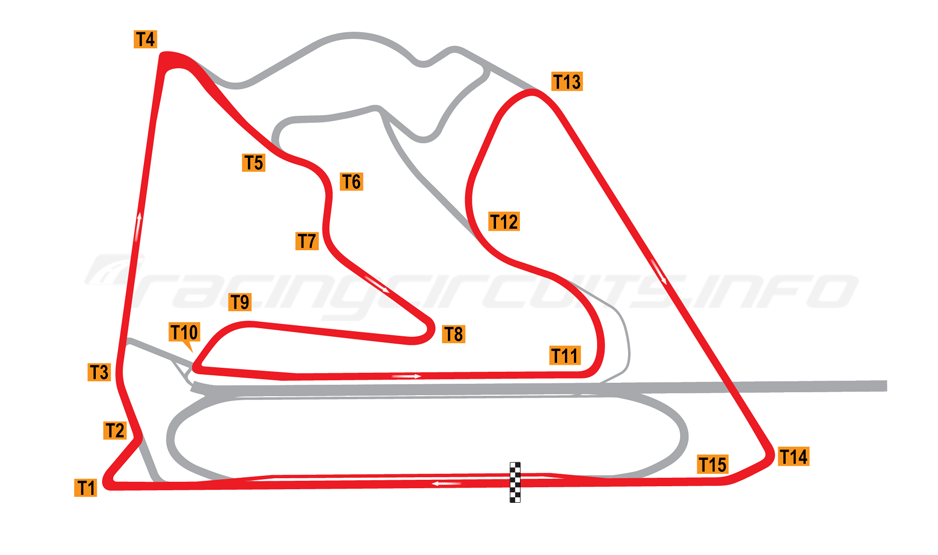
The client made it clear they would need three separate versions of each track.
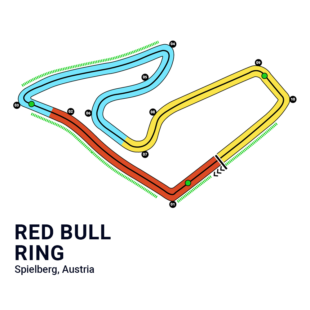
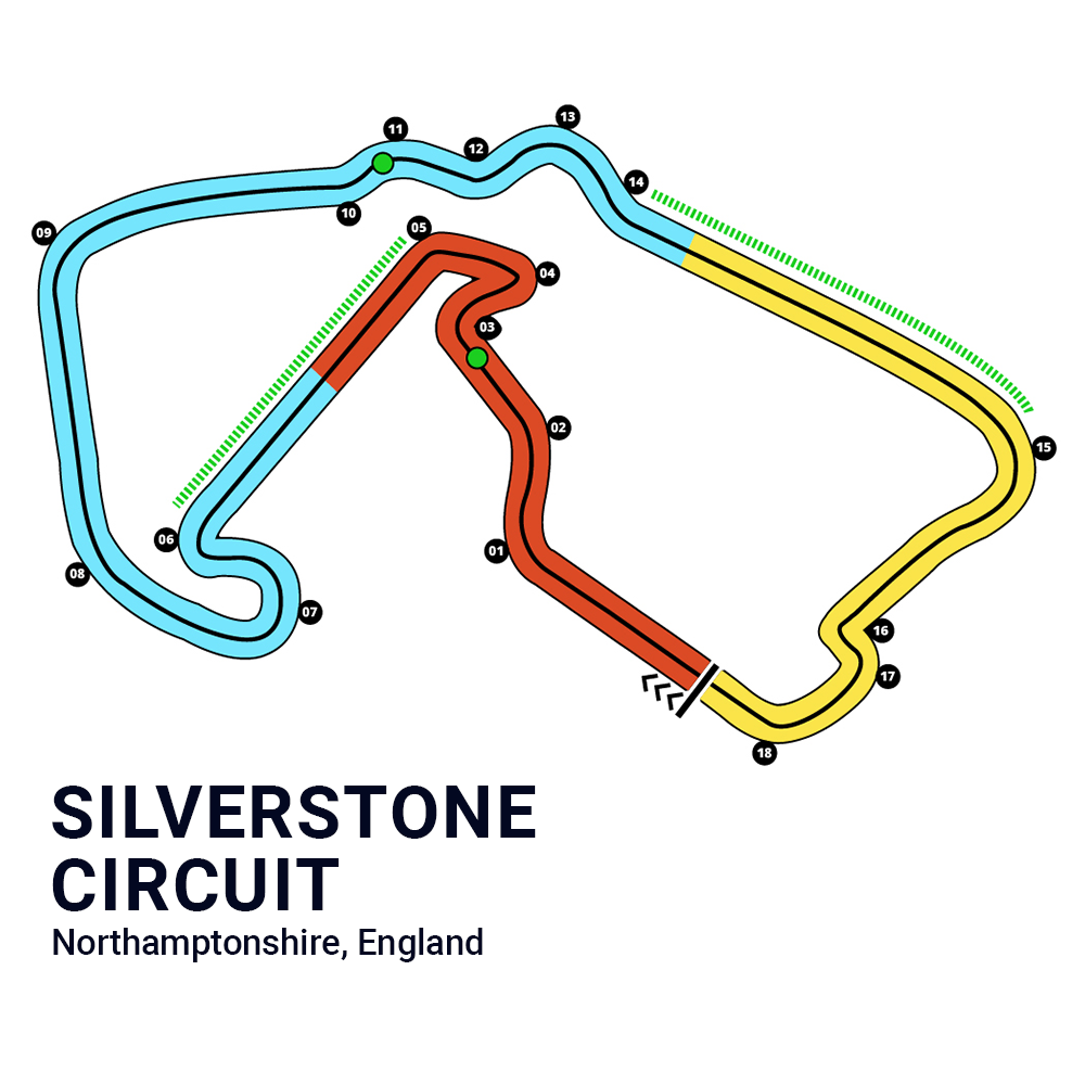
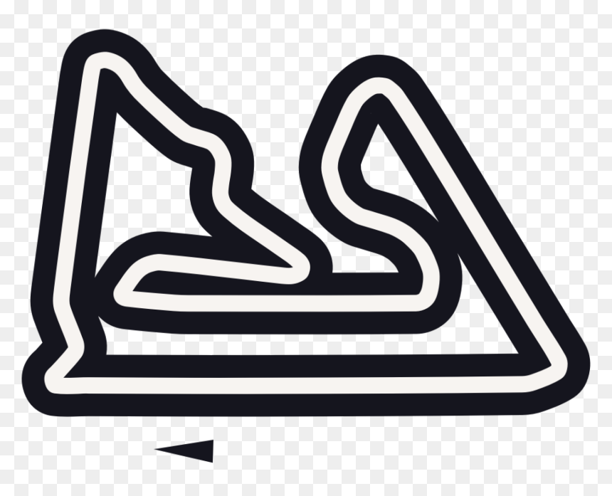
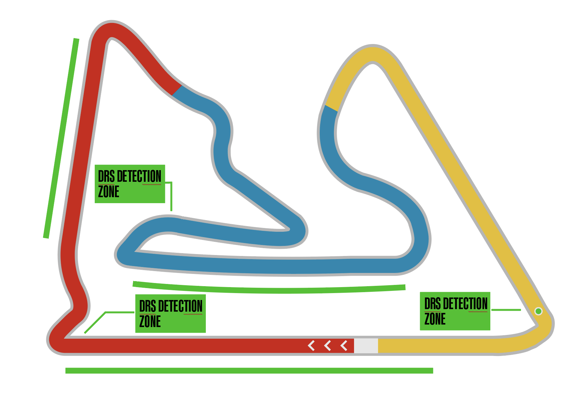
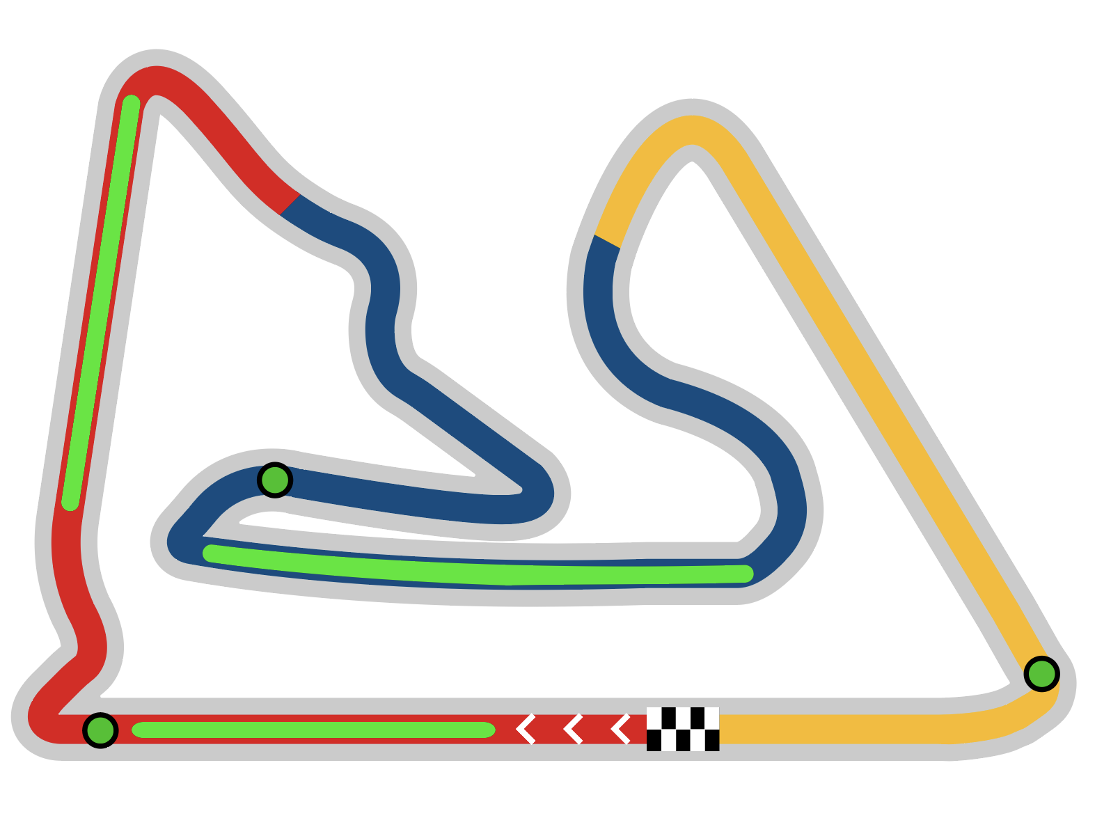
An all-black version of the track for thumbnail views. This shows the track itself, the start/finish line, and the DRS zones (drag reduction zones, or the go fast zones for you non-racers out there.)
A simplified version that showcases everything from the monochrome version, but with the addition of colors signifying the sectors on the track.
A detailed version that shows everything from the previous two, but includes corner numbers for those real detail-oriented fans to study every corner.
Final Assets
You get a track, and you get a track! Oprah jokes aside, there were a ton of tracks for this project. In the end, we are all incredibly satisfied with the result. Every corner, bend, straight — all completely accurate to the real life layouts. Simultaneously, the colors pop, and allow the vital details to be quickly and easily digestible by F1 fans at a quick glance.